Krewfetti
An AI marketplace that stopped searching and started planning
The brief was “add AI search.” We built it, shipped it, and replaced it. Finding a vendor was never the job. Planning the event was.
Role
Sole Product Designer
Timeline
6 months, ongoing
Scope
Product Design, Handoff, UI QA
Status
In testing, not yet live
What it is
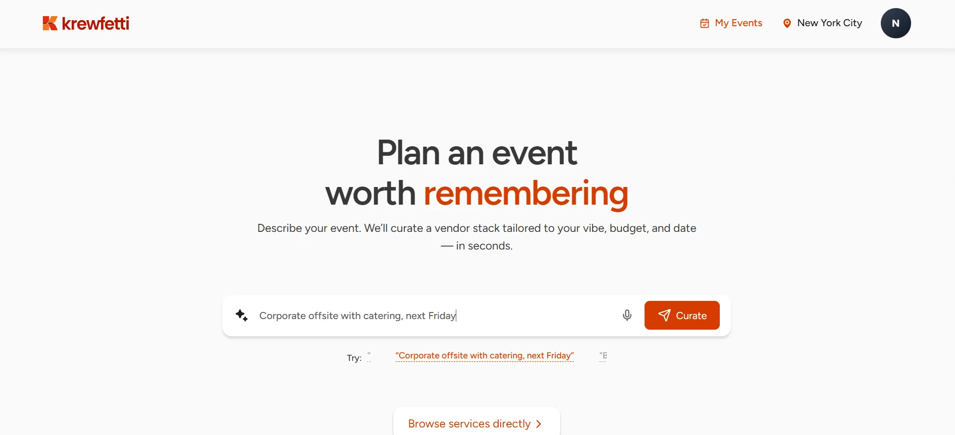
A US marketplace where event organizers book vendors — photographers, DJs, planners, makeup artists, entertainers. Browse the listings, or describe your event and let the platform plan it.
My role
I was the only designer, and I joined after the project had started. There was no low-fidelity phase to fall back on, so every decision was made and tested in high fidelity.
What I owned
- Design the organizer, vendor and admin experiences
- Build the design system: tokens and nine component sets
- Present each round of work to the clients
- Hand off to engineering, then QA the UI on every build
Team
A PM, an engineer and me, with two clients on the calls.
The pivot
Before. One query in, one echo back — showing results for “Kids birthday party with, 20 guests” — then vendor rows by category. No follow-up, no budget, no memory between tries.
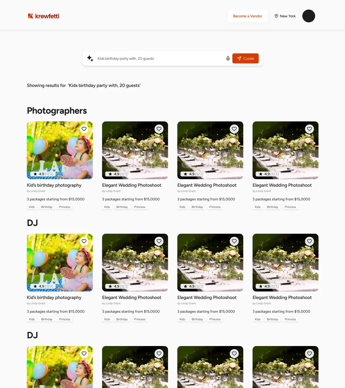
Nothing on that page could be adjusted. Want it cheaper, or on a different date? Retype the sentence.
And every card ended in 3 packages starting from — a floor, not a price. The one number a budget cannot be checked against.
Our PM named it: the AI was doing a search engine’s job. Nobody sits down to find a photographer. They sit down with a date, a budget, a guest count, and a list of things to book.
The patch that failed. We layered manual filters onto the AI results. Two control systems for one intent.
After. A prompt no longer returns results. It opens a full-screen conversation and creates an event.
Date, guests and budget become editable chips. The assistant asks for what it’s missing, says what it can’t do, and returns a plan by category — priced cards, saved with one tap. Each event keeps its own list, so planning can stop and restart.
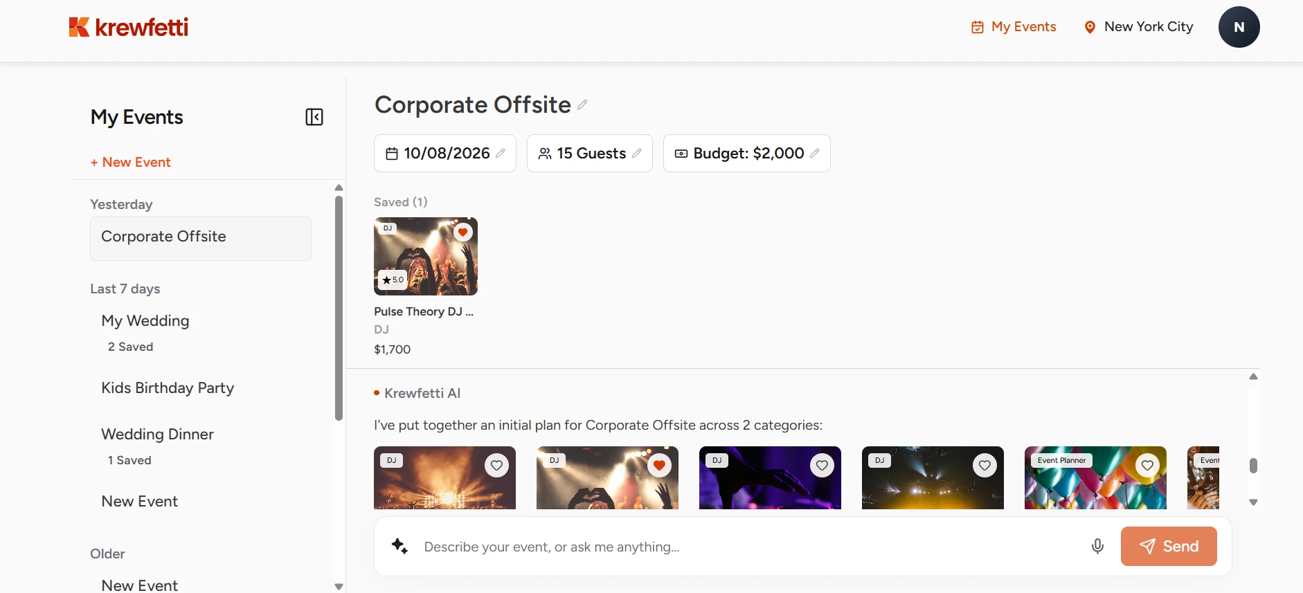
On a wide screen the event opens into three fixed regions. Past events down the left. The event’s facts and its booked and saved vendors pinned across the top. Everything that moves happens in the middle.
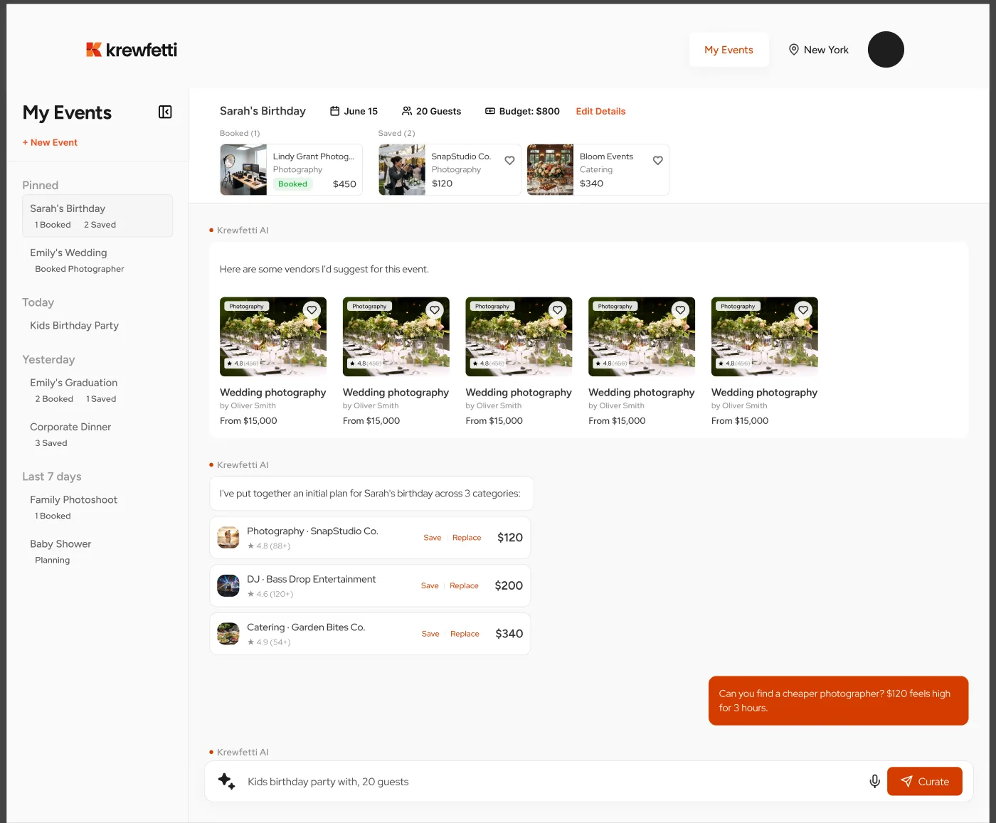
Every card carries Save and Replace, not Save and nothing. A plan gets made mostly by turning things down — and in a chat, the only way to turn something down is to complain in prose and hope.
Replace keeps the slot. The plan still has a photographer in it, just a different one.
Kayak’s assistant does this in a popup. We gave it the whole screen, because the conversation and the results have to sit on the same surface.
The decisions underneath it
Four calls, each one a trade. None of them is free.
01
Facts live in fields, not in sentences.
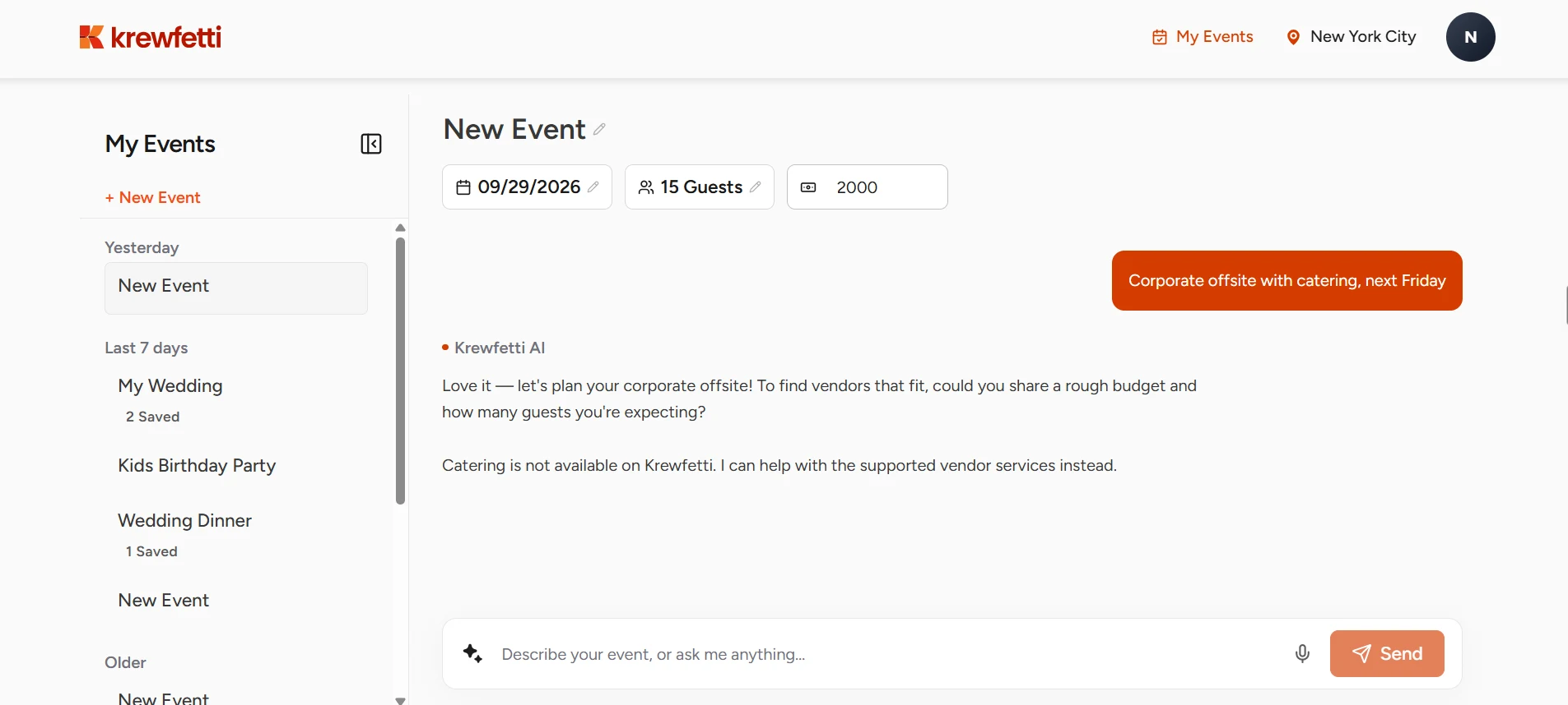
A budget typed into a chat scrolls away. Date, guests and budget sit above the thread as chips you edit in place, and the assistant plans from them.
The cost — the same fact now exists twice, as a chip and as the sentence that set it. The two have to agree.
02
The assistant says what the platform can't do.
Ask for catering and it tells you catering is not on Krewfetti, then works with what is. An assistant that improvises past the catalogue sends organizers hunting for vendors that don't exist.
The cost — the gaps in the catalogue show up in the first reply.
03
One price, never “starting from.”
Every package carries a real number, so a plan can end in a booking instead of a quote thread.
The cost — vendors price their work up front, and genuinely custom jobs have nowhere to go.
04
Saving belongs to the event, not to a wishlist.
A saved vendor lands inside the event being planned, so two parties keep two lists and the plan you return to is the one you left.
The cost — a vendor you like twice gets saved twice.
What we iterated on
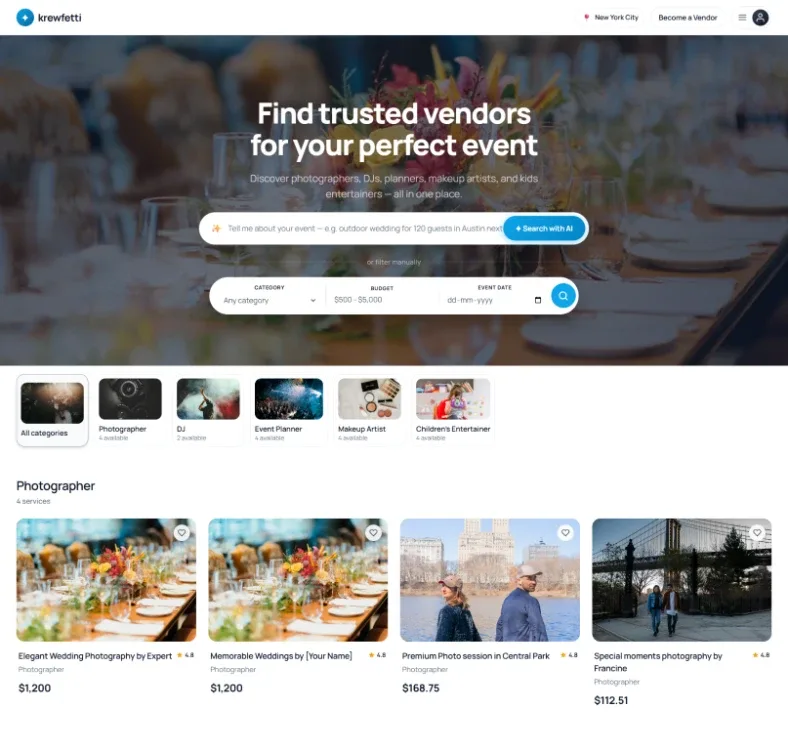
What I walked into. A blue directory, down to the logo. Find trusted vendors for your perfect event, category tiles counting who was available, grid after grid of services.
The AI bar was already there, already asking for a sentence. And directly under it: or filter manually.
The visual language. Five directions, all of them carrying the same new headline — plan an event worth remembering. A promise instead of a lookup, and the one thing every version since has kept.
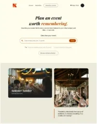
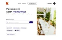
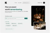
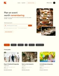
Four redress the hero and stop. The fifth keeps the inherited page’s one good idea: priced vendor cards a single scroll under the promise.
Proof the catalogue is real, before anyone has typed anything. Every version after it inherits that layout.
Then the structureThe home page grew a catalogue, then lost it — four versions, June to JulyShowHide
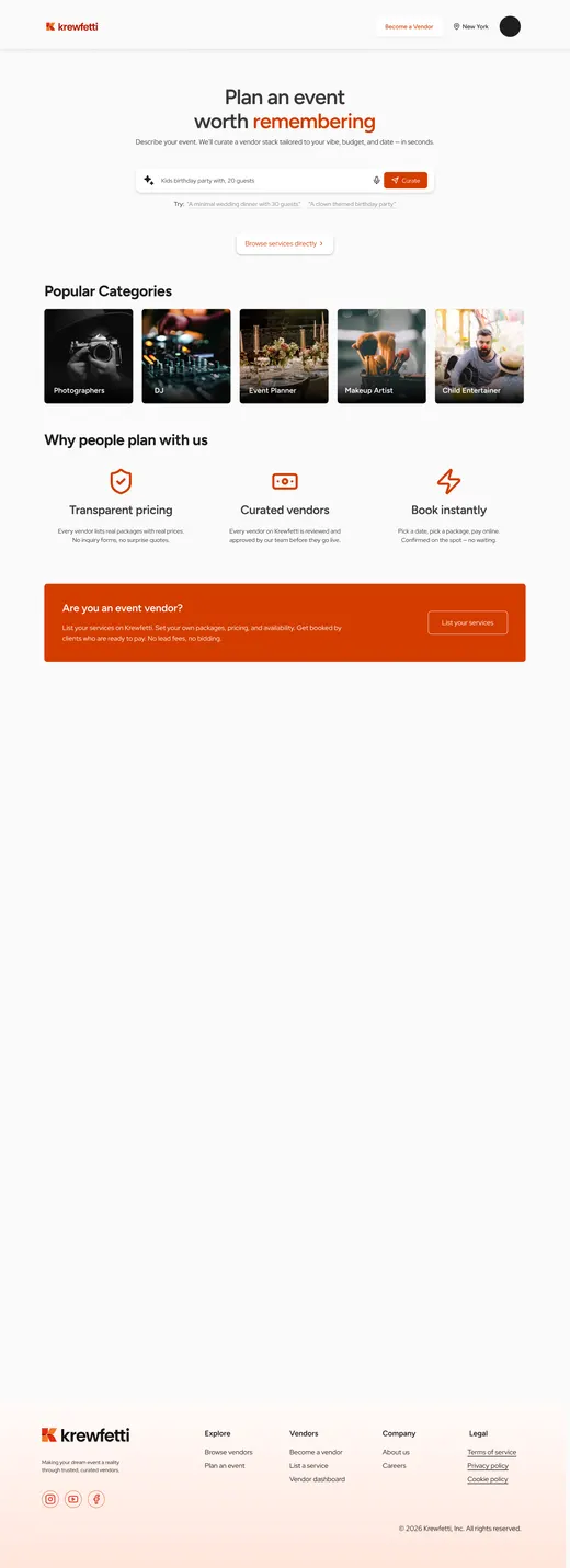
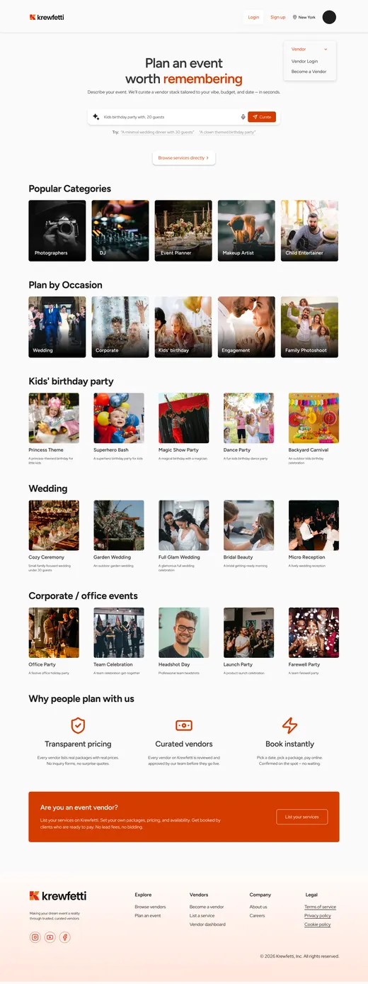
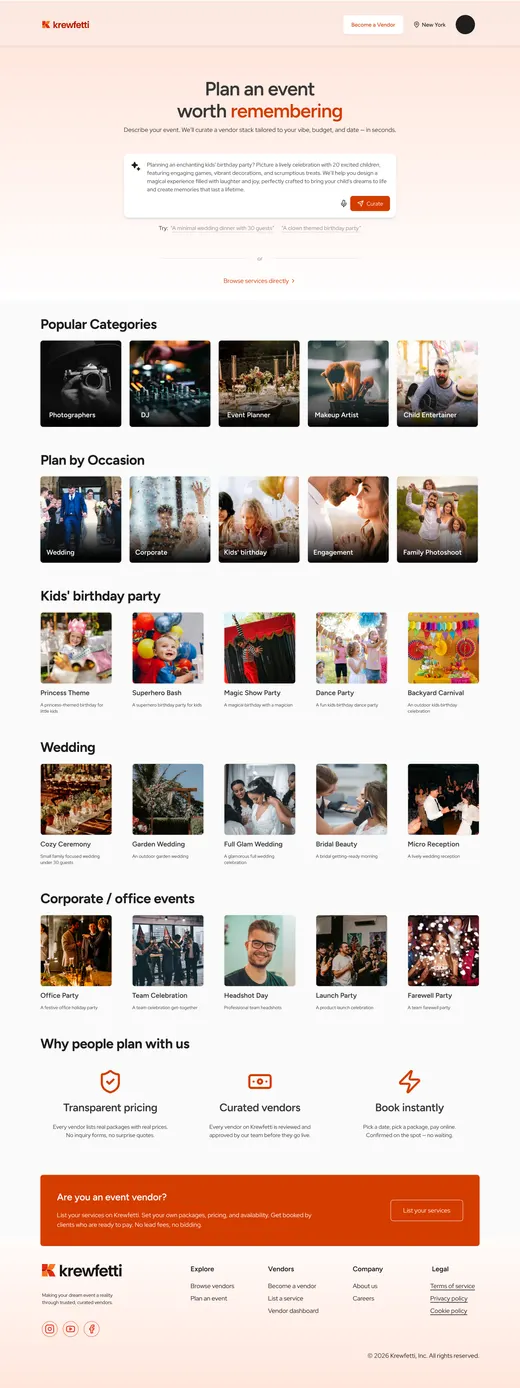
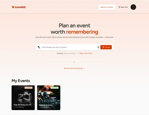
Three versions spent answering what can you book here. The fourth stopped answering it.
Once a prompt opened an event, the browse rows were a slower path to the same place. They came out. One link replaced them: browse services directly.
The system
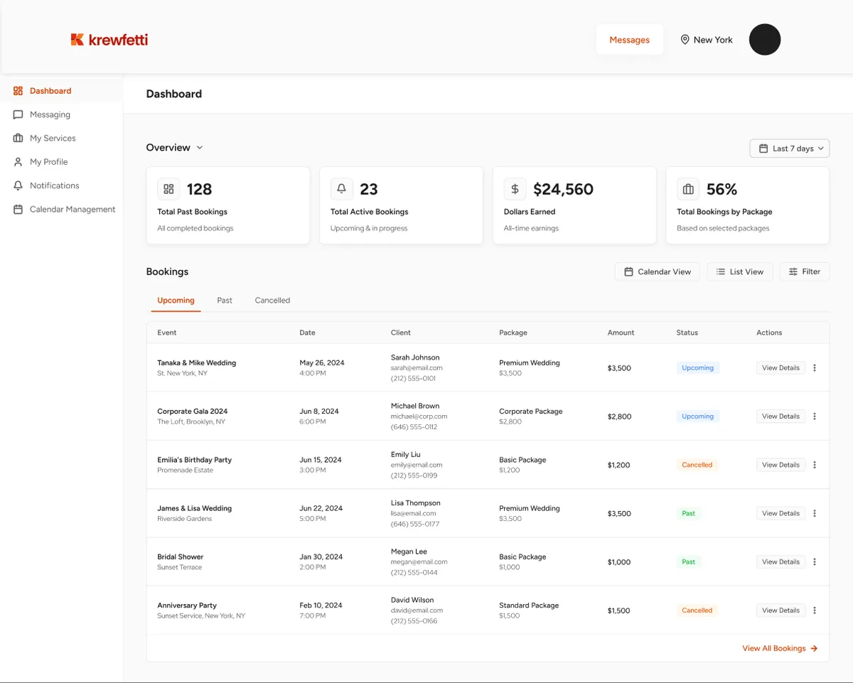
Tokens and components came before screens. Three interfaces, one designer, one engineer — the vendor panel and admin tools had to be built from parts that already existed, or they would not have been built at all.
Nine component sets, named for the job rather than the shape. The last one is the planner’s: the pivot needed parts the search page never had.
Organizer
Plan an event, save vendors, book and pay.
ShippedVendor
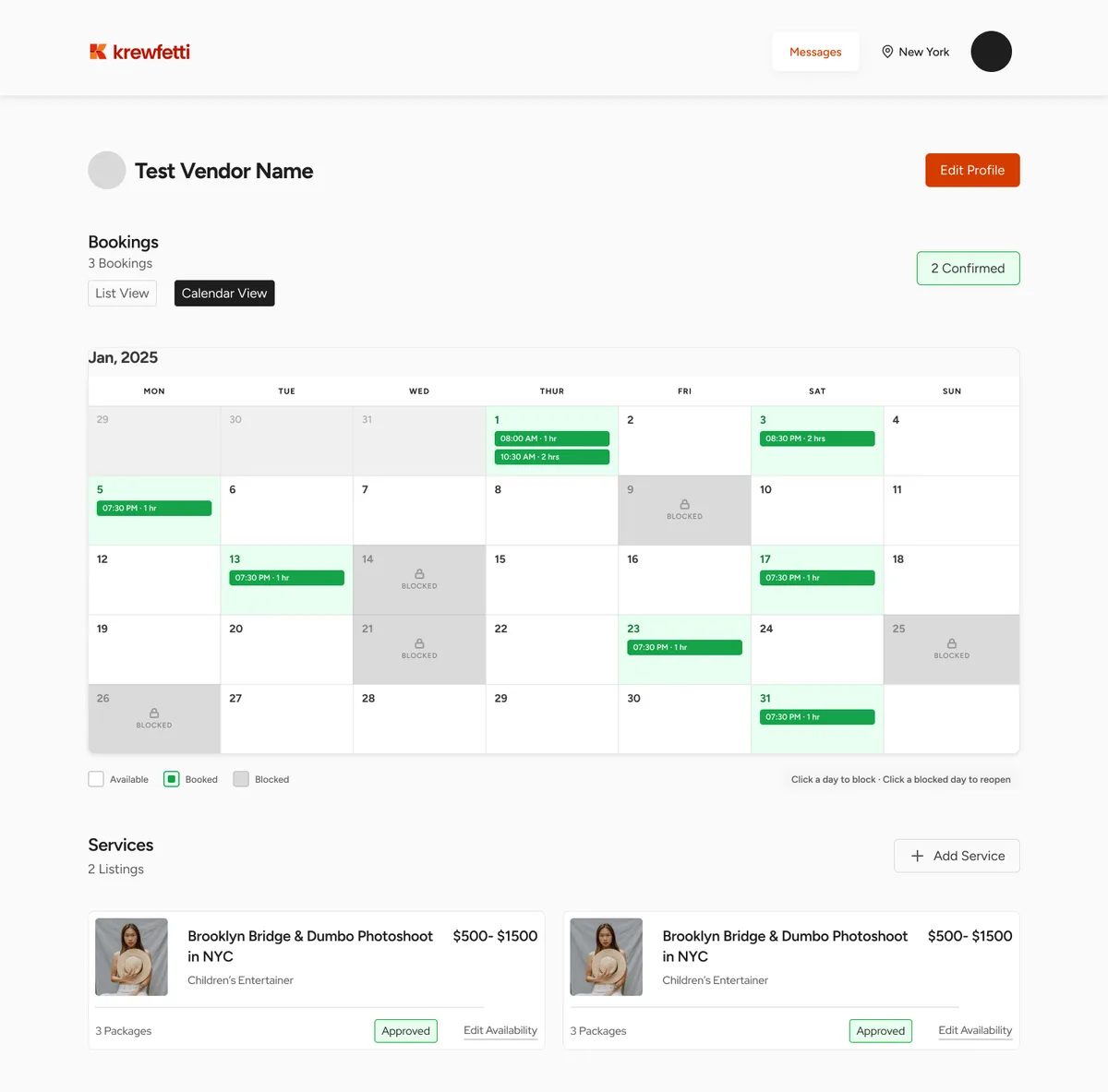
List services and packages, hold a calendar, accept or decline.
ShippedAdmin
Approve vendors, manage incoming requests.
In progressI designed all three. Only one of them needs a note.
Vendors are the supply
A plan is worth nothing if no vendor accepts it. Vendors set their own prices, hold their own calendar, and accept or decline every booking themselves.
The trade-off: three priced services before a vendor is even approved. Real work before anyone has earned anything — and the reason a booking can complete without a single email.
So the same AI that plans for the organizer drafts for the vendor. Step four of five opens with Suggest packages with AI, and every field stays editable. The assistant’s other job is filling the catalogue it later plans from.
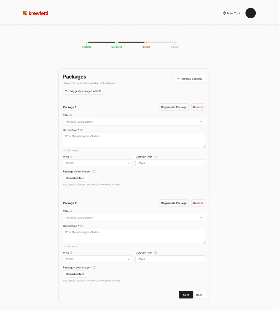
The finished panelWhere a vendor actually works — the dashboard and the calendarShowHide
Cancelling is a lever with a price on it. A vendor can call off a confirmed booking. Before they can, the screen says what it costs them.
The customer is refunded in full, the vendor is paid nothing, and repeated or last-minute cancellations affect ranking, Instant Book access and account standing. Only then does it ask why — and the reasons are sorted by whose fault it was.
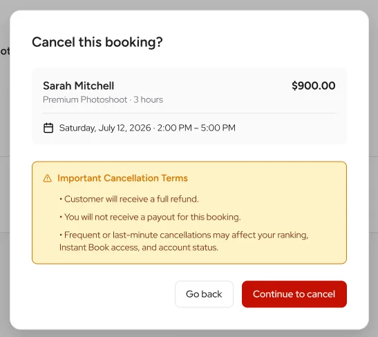
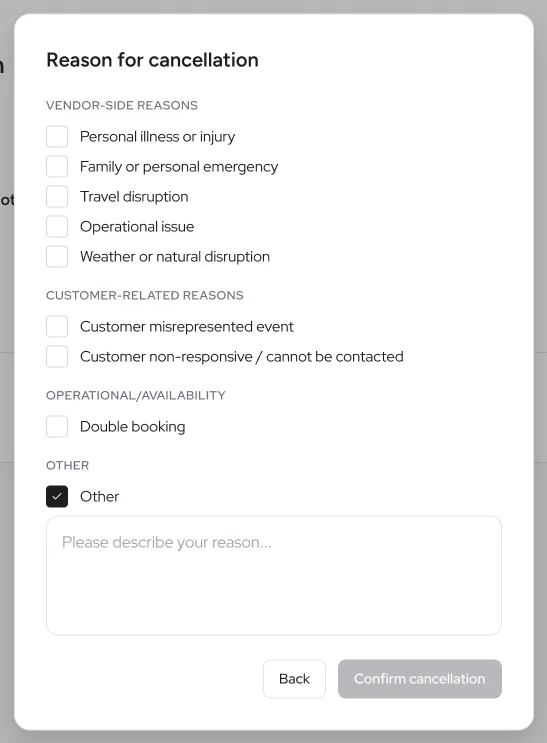
The consequence comes before the form. A vendor who is going to cancel anyway should learn the price before they fill anything in, not after.
UI QA was mine too. Every build came back through a tracker, one row per item, open or closed. Design ended when the row closed, not at handoff.
Where it stands
Six months in, running on dummy data, not yet on the live domain. No outcome metrics, and I’m not inventing any.
What I take from it
The call to rethink it came from our PM, not me — and I had designed the search version being replaced. Getting it right the first time is luck. Letting go of shipped work is the skill.