City Girls Delhi
A brand-first website for a 50,000-member women-only community
Discovery and booking were split across Instagram, Linktree, and payment forms. One address replaced all of it.
Live Project
Visit live site →
Role
Solo Product Designer
Timeline
2 weeks
Scope
Brand, Website
Status
Shipped & live
The Brief
City Girls Delhi is a 50,000-member women-only community in Delhi. No brand system, no website — the personality lived entirely on Instagram, and the ask was a site that matched it.
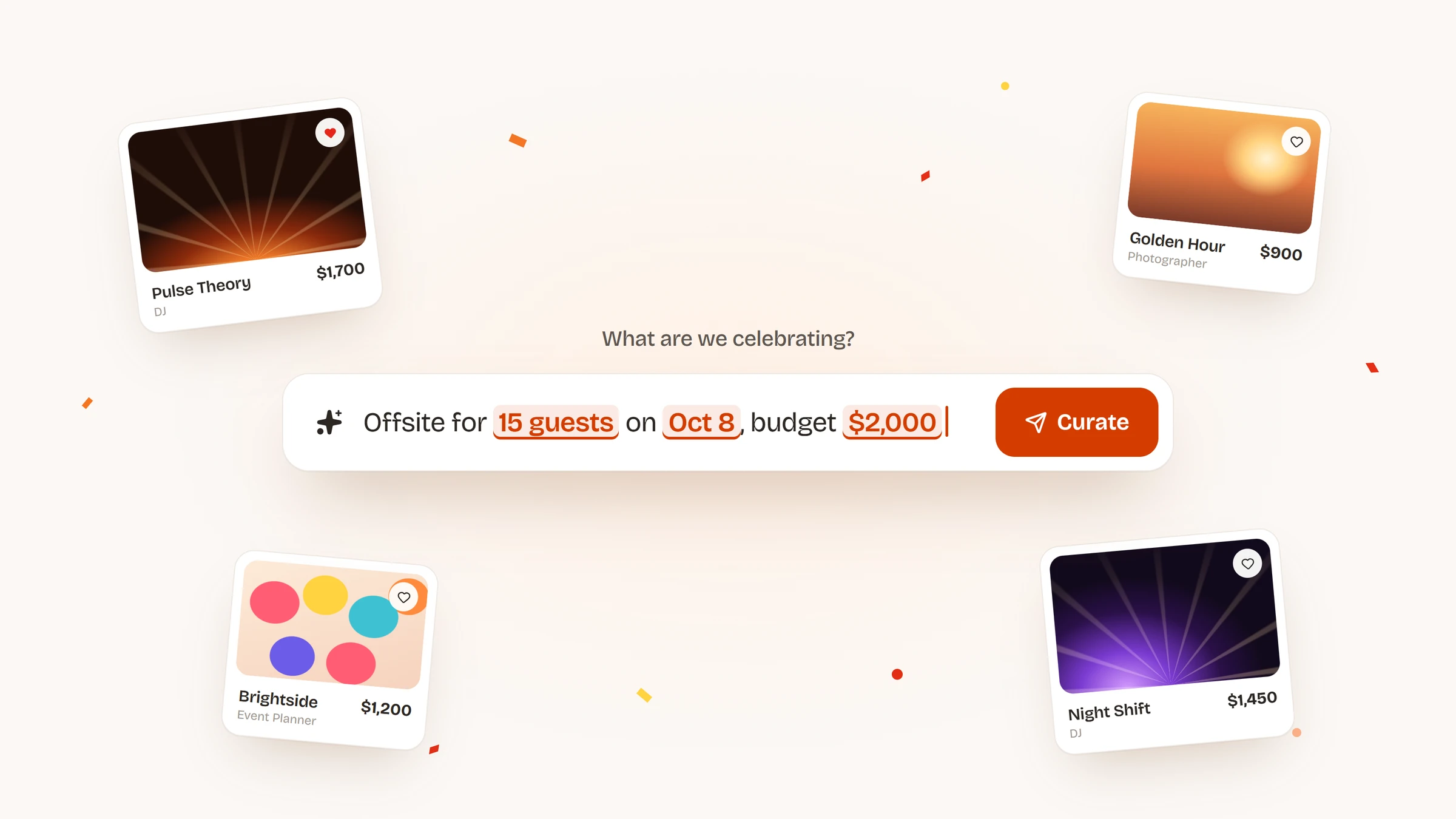
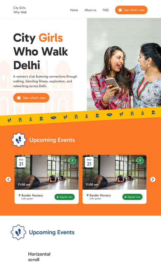
Part one: carry the feed onto the web. A women-only community, so the visual language is girly on purpose, and the whole thing had to read as fun — the brand is loud and extroverted, and the site had to behave that way. Events and workshops up front, real photography, no stock.
Part two, requested after the design was done: the client needed to manage content herself. A dashboard was built for that. It is not covered here, but it changed the website — every component now had to hold content she would edit.
Context
No fonts, no colors, no identity. The Instagram feed had cycled through several visual themes over the years. That was the only source material.
Events span movement (walks, yoga, dance), learning (expert-led sessions), and leisure (pottery, journaling, craft). The site had to hold all three.
Press from Outlook Traveller to Times of India had piled up with nowhere to sit.
Covered in
Times of India · Mint · Outlook Traveller · The New Indian Express · She The People · Curly Tales · So City · Times Now · The Patriot
My role
I was the only designer, starting from a blank slate. Two weeks, from no identity to a site the client runs herself.
What I owned
- Build the brand from zero: type, color and the emoji strip
- Design the website for phone and desktop
- Design the event pages and the booking flow
- Rework every component so the client can edit it
Process
Brand direction
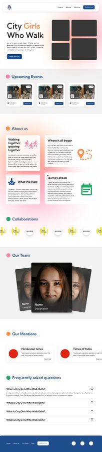
Type, color, and layout were all set from zero. The Instagram archive gave the direction: bright color, rounded shapes, photography first. External sites came in as execution reference, not identity.
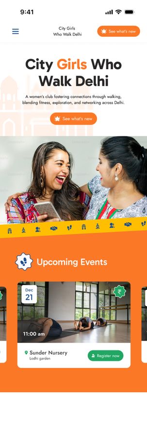
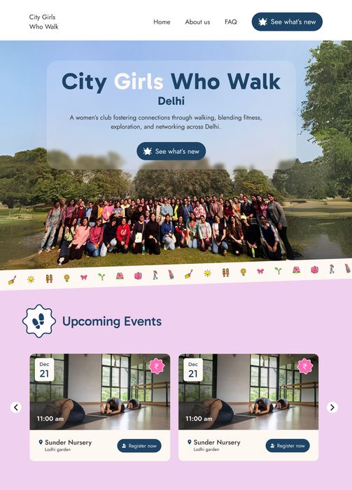
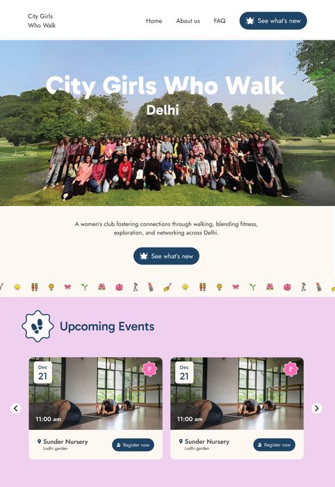
Early passes tested a different name (City Girls Who Walk), placeholder layouts, and several hero treatments, across desktop and mobile, before type and color settled.

Emoji strips
Section breaks had to carry the brand, not just end a section. First pass: white outline icons on a skewed hot-pink band — read as signage. Second: sticker emoji on flat pink, where pink on pink flattened them. Final: a brighter set on cream — the colour survives, and the strip separates sections without shouting over them.



What changed between design and ship
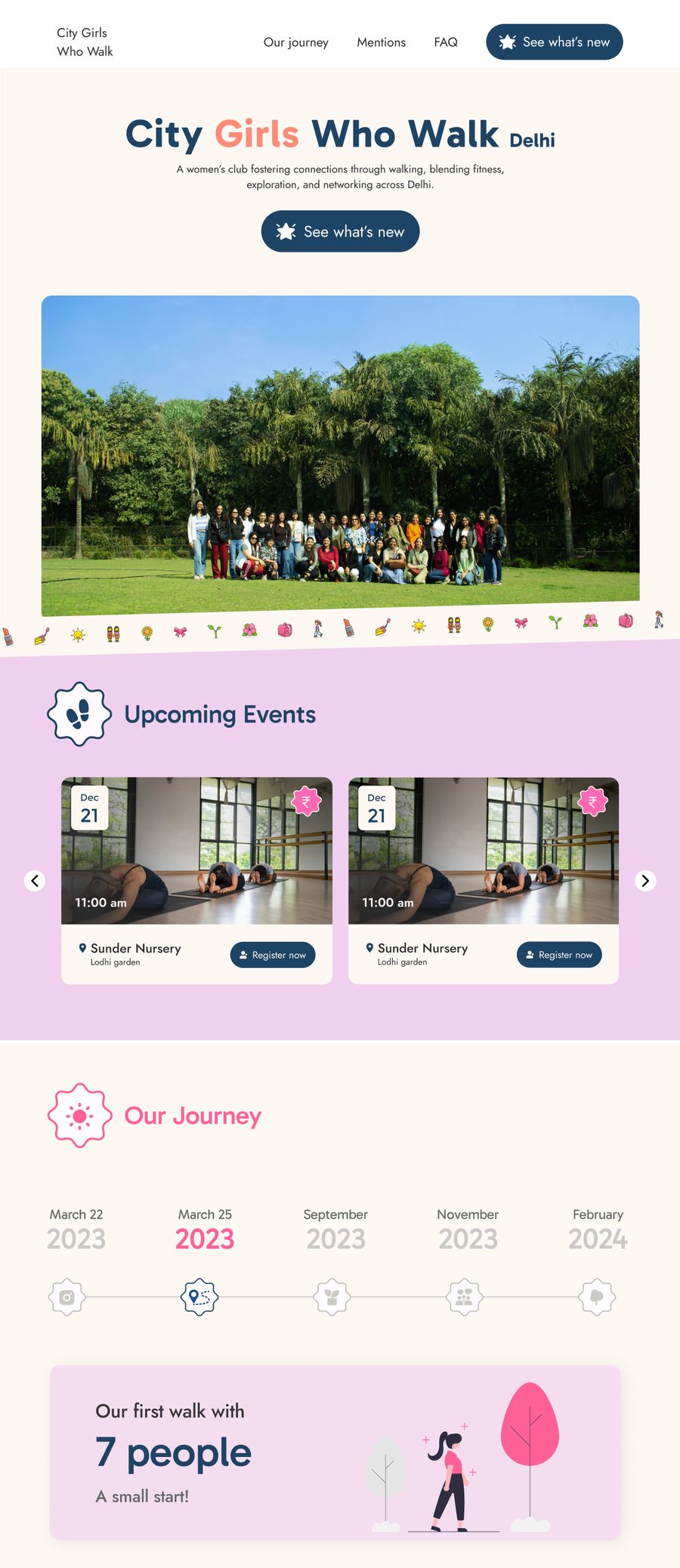
The dashboard requirement landed after the design was finished. Every component was re-tested against it: some cut, others simplified to survive dynamic content. The name, the brand, and the timeline section all changed before ship.
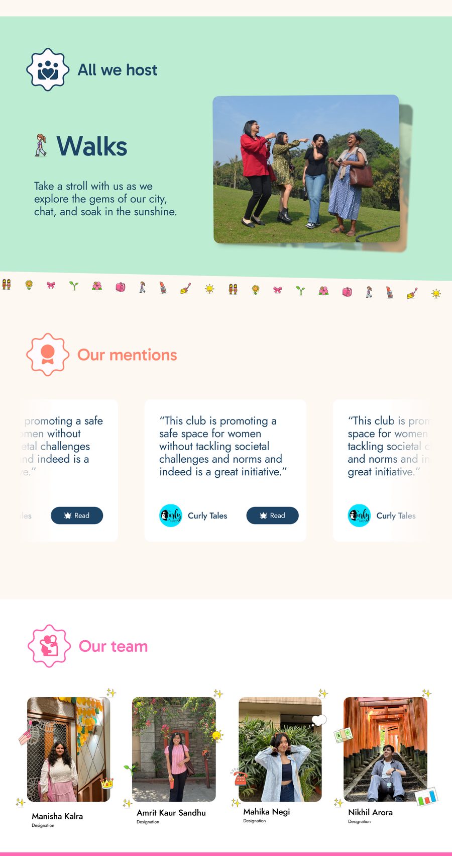
Version one of “done” was a finished website. The shipped version was a system the client could run alone.
Key Design Decisions
Events by energy, not chronology
Not a date-sorted list. Events group into Movement, Learning, and Leisure — how members decide what they want to do, not how the organizer schedules.
Five stops became one
Browsing, reading and paying now happen on one page.Before: 5 stops
After: 1 stop
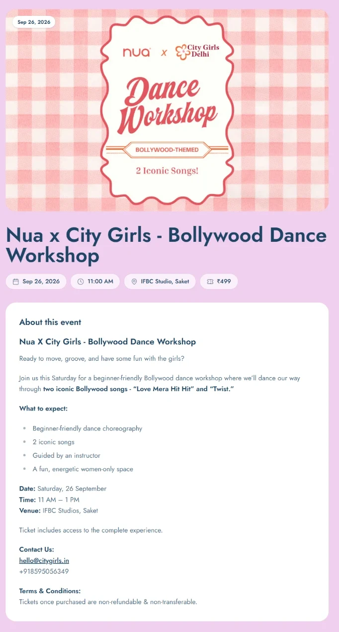
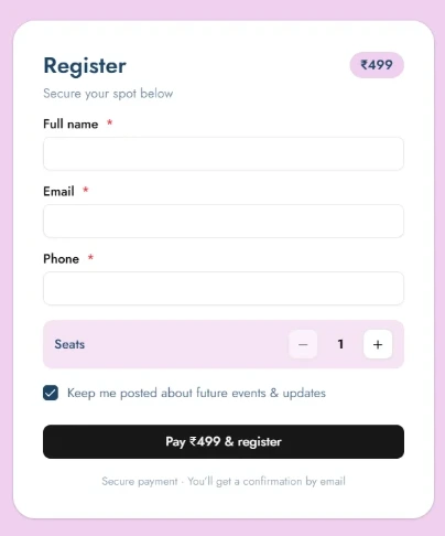
The register card is pinned. However far the description runs, the thing that takes the booking is still on screen.
Constraints & Trade-offs
Every component had to pass one test: can the client update this herself?
“Our Journey” was removed
A timeline of the community’s growth. It worked as a story, but it could not be made editable without either flattening it or building a complicated editor. Cut.
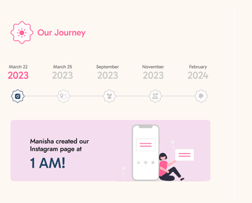
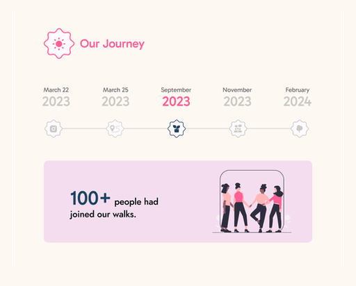
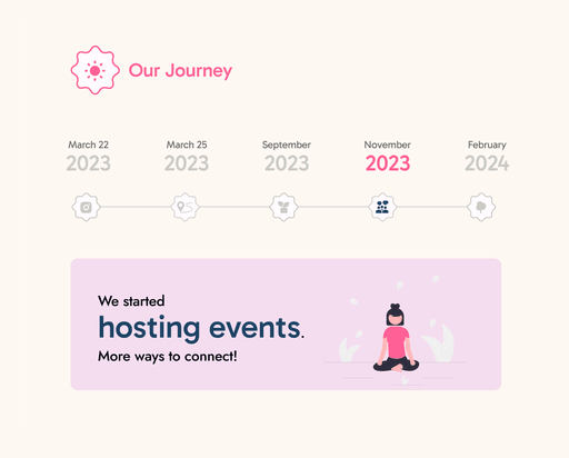
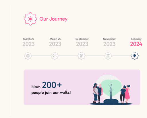
Every state above is a hand-built layout, not a template. That is exactly why it could not move to a CMS.
Components redesigned for editability
Layouts tied to exact copy lengths and fixed image crops broke under dynamic content. A static design can be precise; an editable one has to be resilient. Visual specificity gave way to flexibility.
Impact
Active users
9.5k
Bought a spot
295
On a phone
94.3%
Direct sessions
5.4k
Google Analytics · Jul–Sep 2026
Event pages hold people. The homepage bounces at 32.3%. Event pages, built to do one job, bounce at 9.4–21.4%.
The bio link is no longer the only door. Direct sessions beat Linktree and Instagram combined. “Registration confirmed” was viewed 507 times in 28 days.
Mobile was the brief, not a breakpoint. 94.3% arrive on a phone, most at 390–400px. The stacked event page and pinned register card were drawn for that screen.
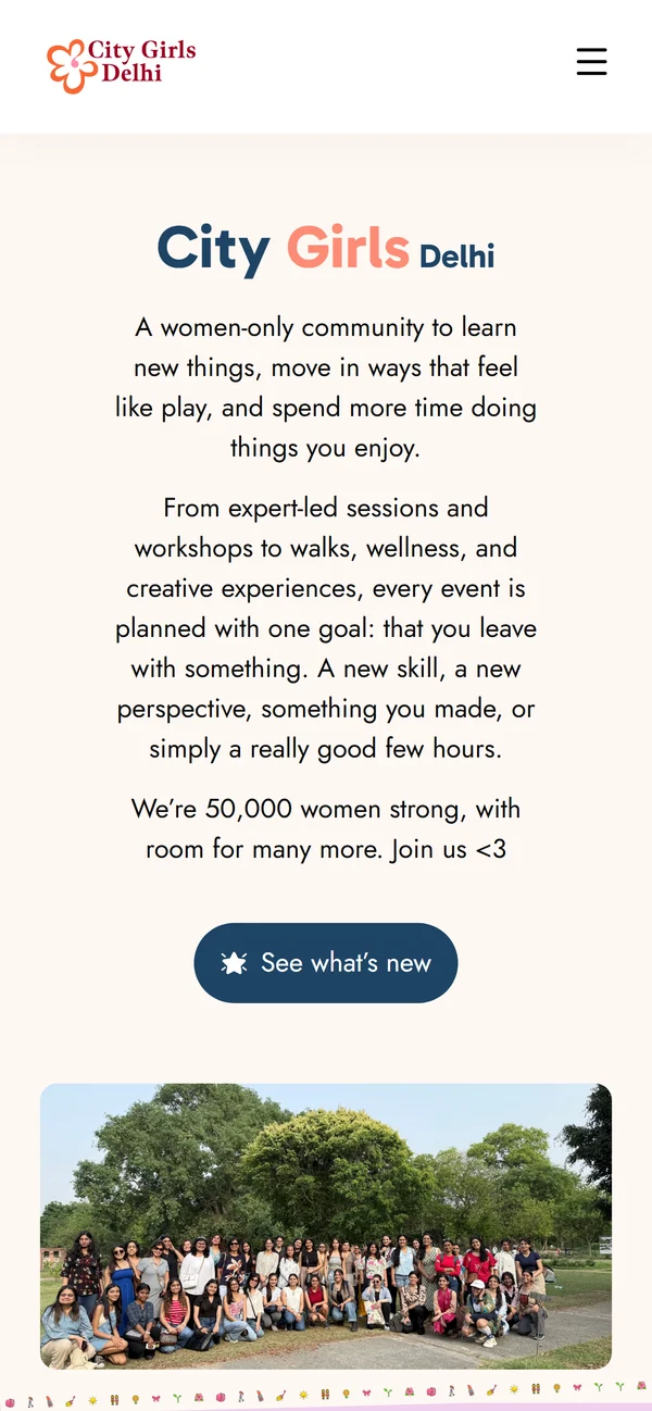
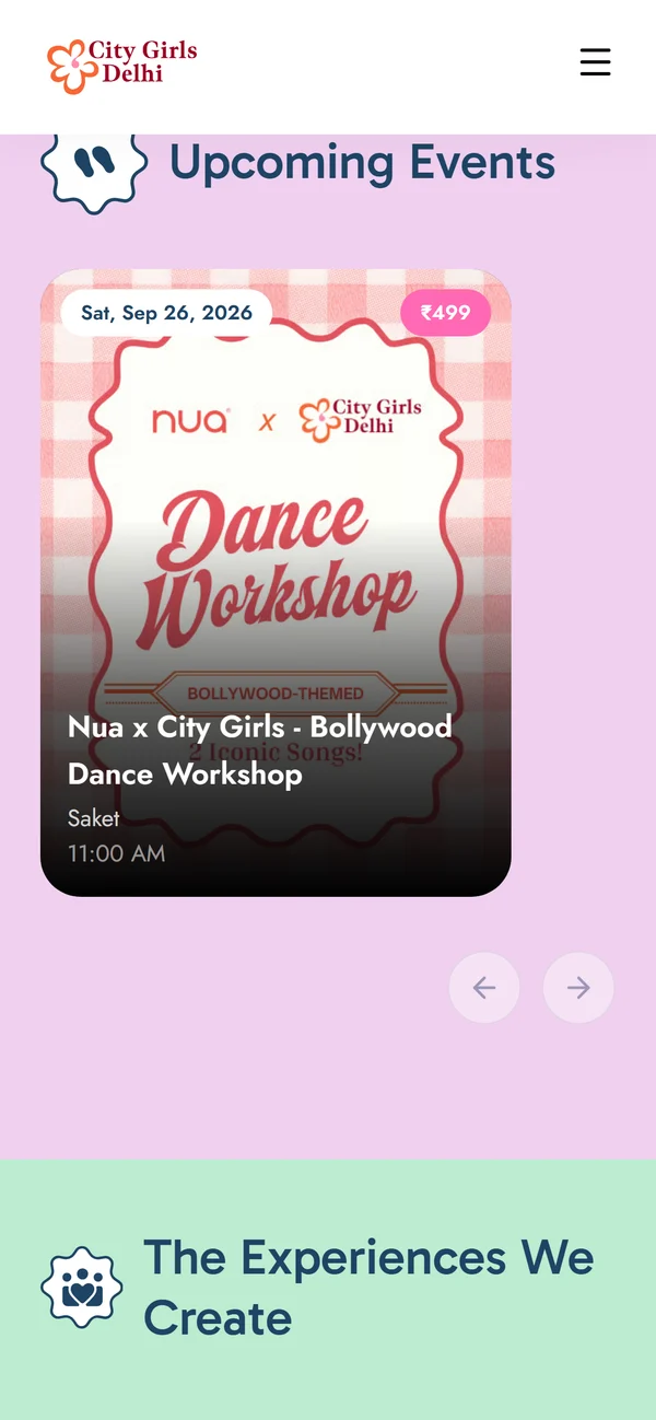
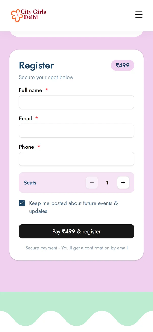
On a phone the two columns stack: description first, register card under it, the pay button always a thumb-reach from the bottom.
Before: five stops across four apps, ending with a payment screenshot as proof.
After: one page, and the client publishes events herself.
Reflection
Two weeks, no brand assets, every call had to land first time. The dashboard arriving late taught the harder lesson: a design that cannot absorb change is not finished.