Align
Designing a cycle-aware productivity system
Most productivity systems assume consistency.
The human body doesn't.
Overview
Align is a cycle-aware productivity system that helps users plan around fluctuating energy, mood, and cognitive capacity instead of forcing themselves into a fixed routine.
The project started with a simple question: if people already understand that their energy changes through the month, why do most planning tools still ask them to behave as if every day should feel the same?
Context
Women experience cyclical changes in energy, mood, and cognitive ability. These shifts influence how they work, think, and feel on a daily basis.
Most productivity tools, however, are designed around a constant-performance model. They assume users can show up with the same energy, focus, and motivation every day.
This creates a mismatch between:
- How users are expected to function
- How they actually experience their day
Existing solutions mostly focus on:
- Tracking menstrual cycles
- Logging symptoms
- Displaying historical data
They rarely help users make better day-to-day decisions from that information.
Opportunity
The project became more interesting during research. Users were already aware of their cycle. They were already tracking it. They were already noticing patterns.
What they struggled with was translation.
The problem was not awareness. It was turning awareness into action.
That insight reframed the challenge from "another tracking app" to a planning system that could support decisions in real time.
Goal
The goal was to design a system that:
- Translates awareness into actionable guidance
- Reduces decision fatigue in everyday planning
- Adapts to fluctuating energy and emotional states
- Supports users without overwhelming them
Why This Matters
This project reflects a broader design interest in:
- Creating systems that adapt to users instead of forcing uniformity
- Bridging the gap between information and action
- Designing for real-life conditions rather than ideal scenarios
Users

Aisha | 29 | UX Designer | Bangalore
Ambitious, structured, but struggles with energy dips disrupting her schedule.
Goals
- Stay productive
- Avoid burnout
- Build healthier rest habits
Frustrations
- Unpredictable low-energy days
- Guilt resting
- Unhelpful apps
Needs
- Cycle-aware planning
- Gentle reminders
- Mood-linked insights

Meera | 34 | Startup Founder | Jaipur
Juggles leadership and health; energy drops affect consistency.
Goals
- Balance work and self-care
- Anticipate cycle shifts
- Manage stress
Frustrations
- Pushes through exhaustion
- Workplace stigma
- Fertility-focused apps
Needs
- Cycle-aware planning
- Discrete guidance
- Practical wellness tips
- Stress recovery tips
Research
Approach
- Survey with 54 participants aged 18-60
- Included users with PCOS, menopause, and irregular cycles
- User interviews
- Healthcare consultation
Key Findings
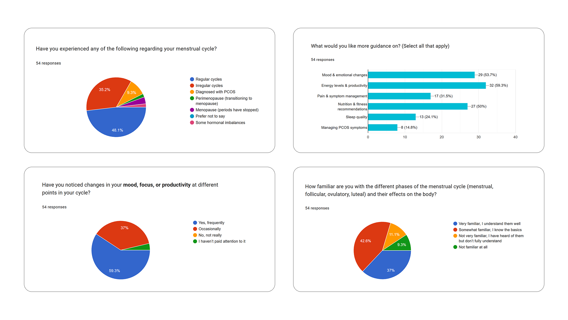
- Users recognize patterns but cannot act on them
- Awareness of cycle phases is fragmented
- There is strong demand for actionable guidance rather than more logs
The problem is not lack of data. It is lack of translation.
Competitor Analysis
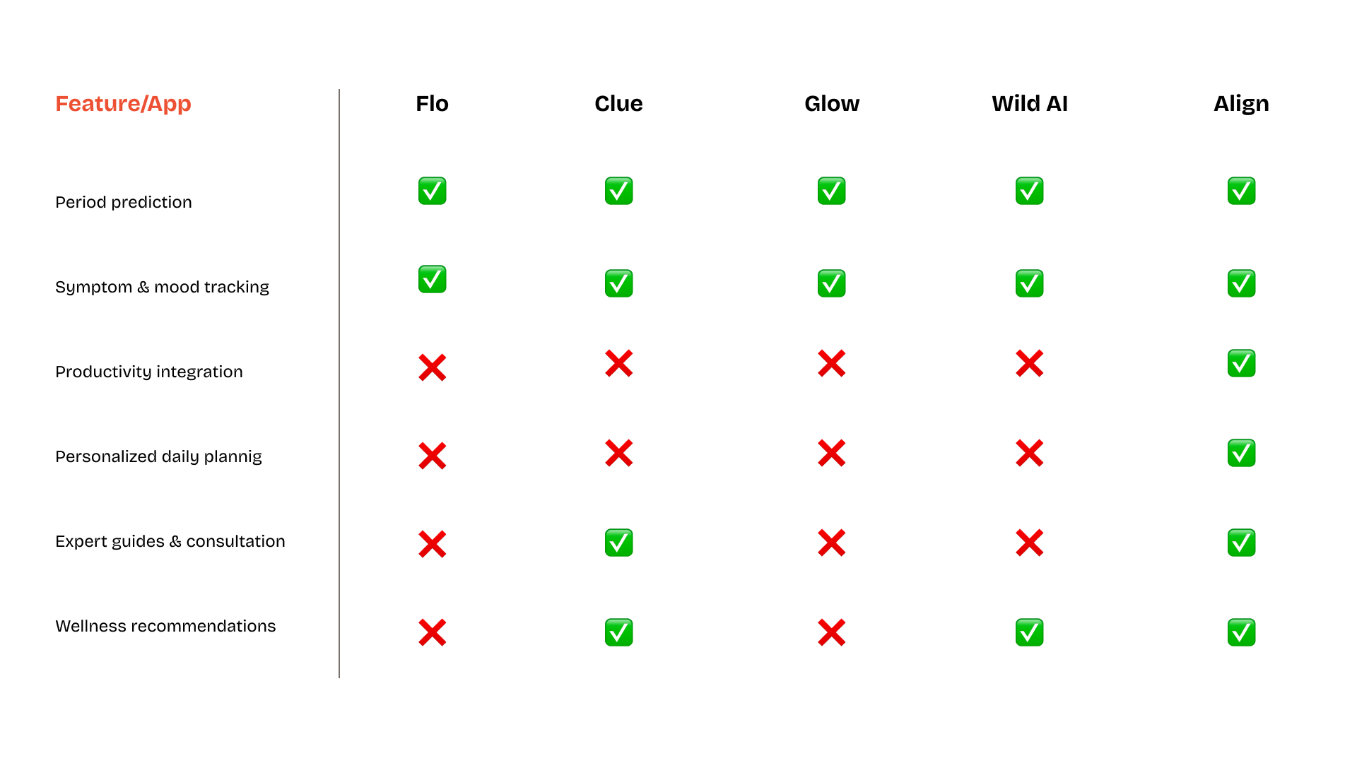
Looking across existing cycle and wellness apps made the gap clearer. Most products were strong on tracking, but much weaker at helping users turn that information into practical planning decisions.
Insights
Insight 1
Awareness alone does not change behavior.
Insight 2
Users do not want to interpret data every day.
Insight 3
Emotional and productivity states are deeply connected.
Design Principles
Reduce Cognitive Load
Users should not have to interpret their cycle manually every day.
Prioritize Action Over Data
Tracking should lead to decisions, not just more information.
Design for Emotional Comfort
The experience should feel supportive and calm, not clinical.
Solution Direction
Early exploration looked at dashboards, habit tracking, and planning tools. The strongest direction came from shifting away from a data-heavy utility and toward something that felt like a daily companion.
The product should feel like a daily companion, not a medical tool.
Product Structure
Information Architecture
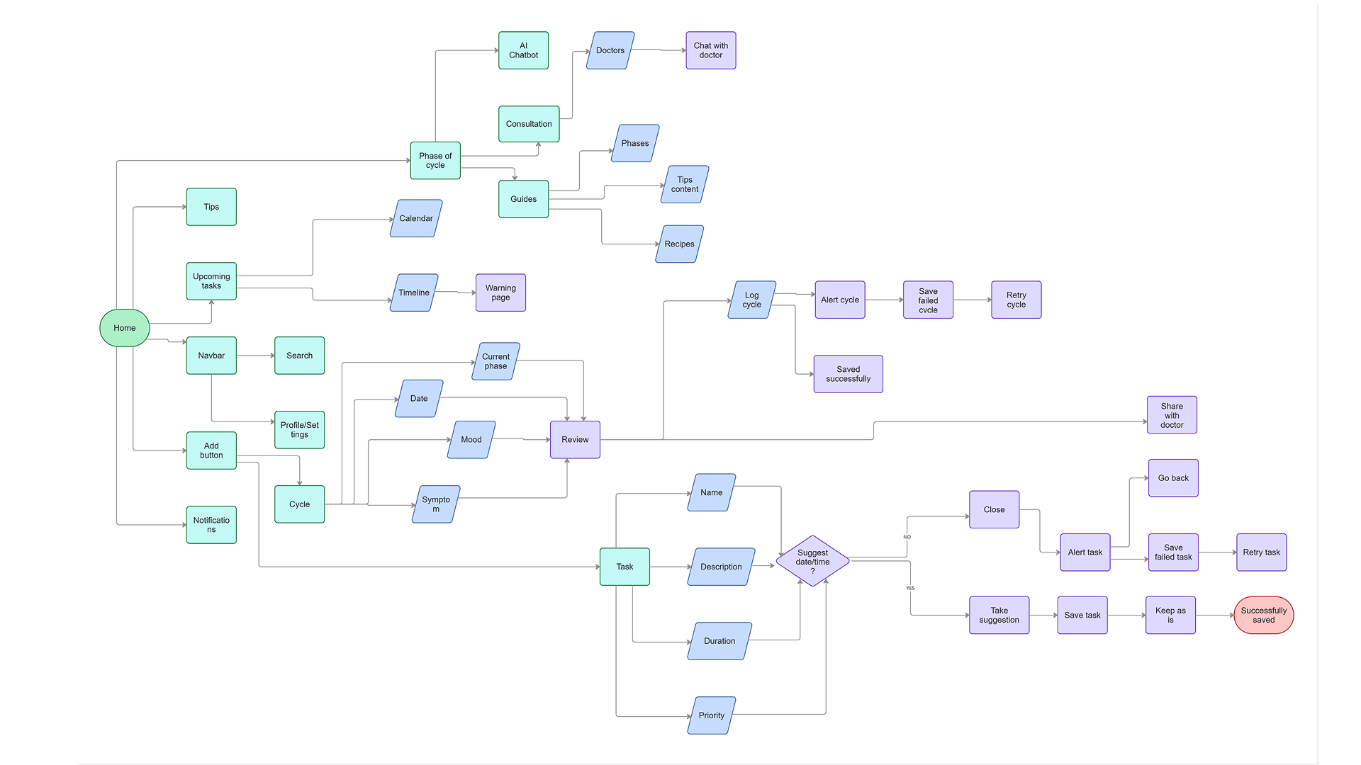 Click to zoom
The structure prioritized:
- A daily overview first
- A calendar for understanding patterns over time
- Minimal navigation and low interpretation effort
User Flow
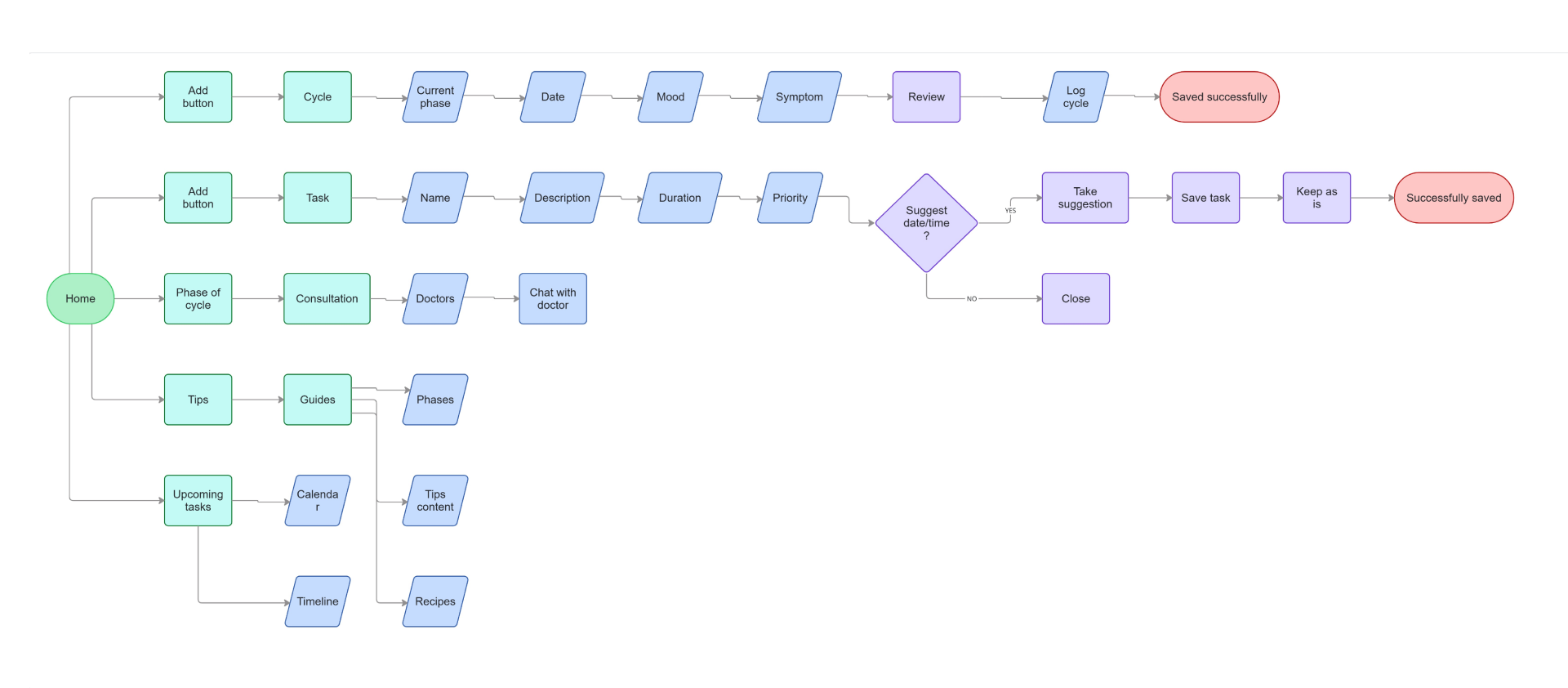
The flow was designed to:
- Reduce friction
- Surface insights at the right time
- Support habit formation
Key Design Decisions
Calendar as the Core Interface
The calendar became the main interaction model because it aligns with existing planning behavior, reduces interpretation effort, and makes cycle data feel contextual instead of abstract.
Simplified Tracking
Tracking inputs were intentionally limited to reduce friction, improve consistency, and make the system easier to sustain over time.
Recommendations Over Raw Insights
Instead of stopping at labels like "low energy," the system translates patterns into guidance. For example:
- Instead of "low energy"
- The system suggests "focus on low-effort tasks"
This removes cognitive effort and helps users act faster.
Non-Clinical Visual Language
Warm colors and soft visuals were used to build trust, increase comfort, and support regular use. The goal was to make the product feel approachable without losing clarity.
Build
Step 1: Map the Information Architecture
The first step was organizing the product around the decisions users needed to make most often. That meant defining the relationship between the daily overview, the calendar, tracking inputs, and recommendation surfaces before moving into UI detail.
Step 2: Shape the Core Screens
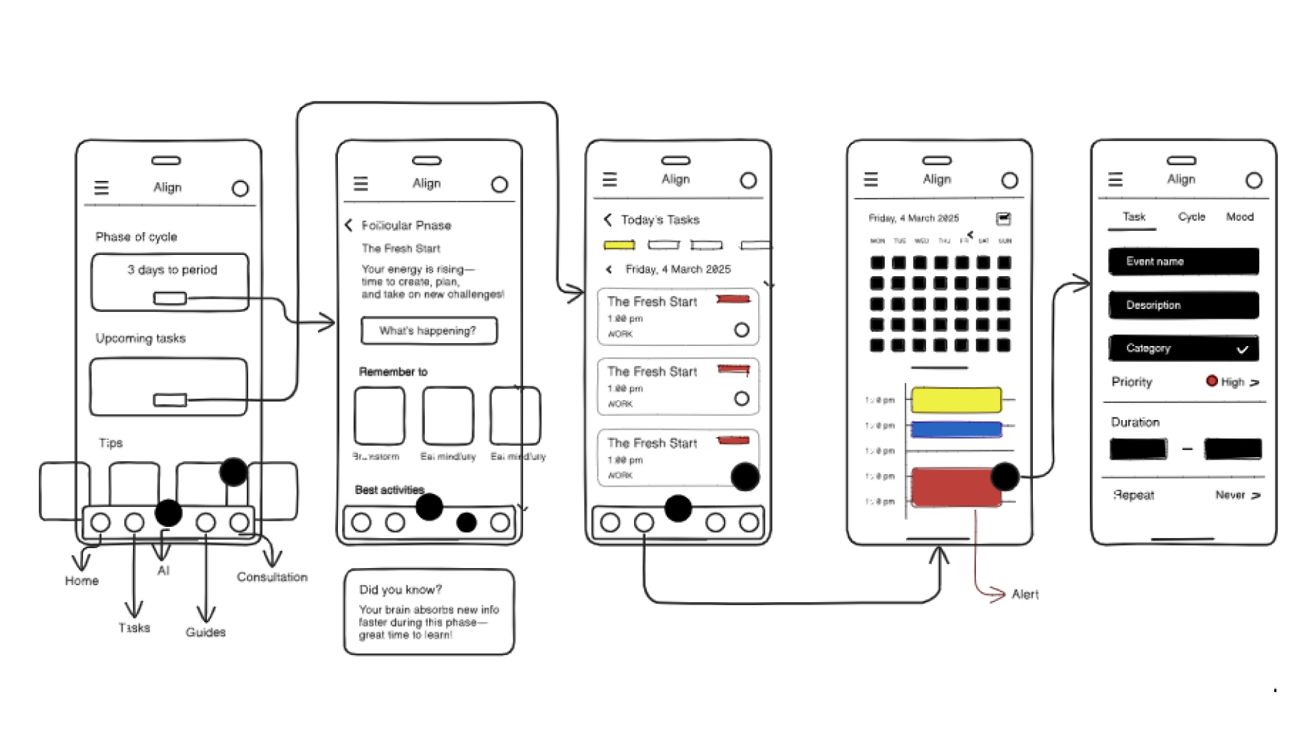 Click to zoom
Wireframes focused on the main moments in the journey: checking the current phase, understanding the day at a glance, and getting clear recommendations without adding cognitive load.
Step 3: Build the Recommendation System
The experience was built around translating tracked patterns into usable prompts. Instead of only showing data, the system pairs mood, cycle phase, and energy context with suggested task intensity and next actions.
Step 4: Develop the Visual Identity
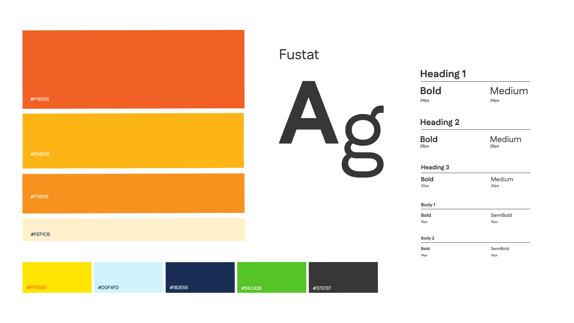
The visual system was designed to feel warm, calm, and non-clinical. Color, illustration style, and soft interface shapes were used to make the product feel supportive while still keeping the information clear and structured.
Solution Overview
The final system brought together:
- A cycle dashboard for phase visibility
- Mood tracking for pattern awareness
- Smart recommendations for daily guidance
- Contextual support for lower-friction decision-making
- Reminders that reinforce consistency over time
Final Interface
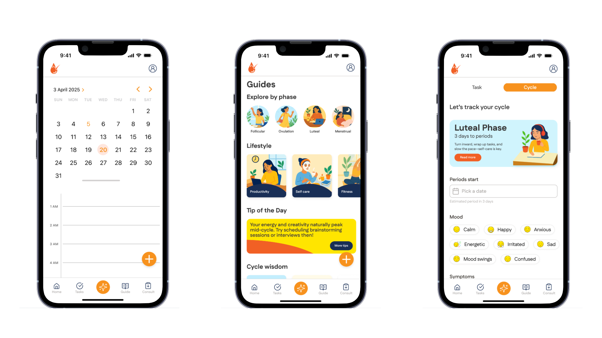
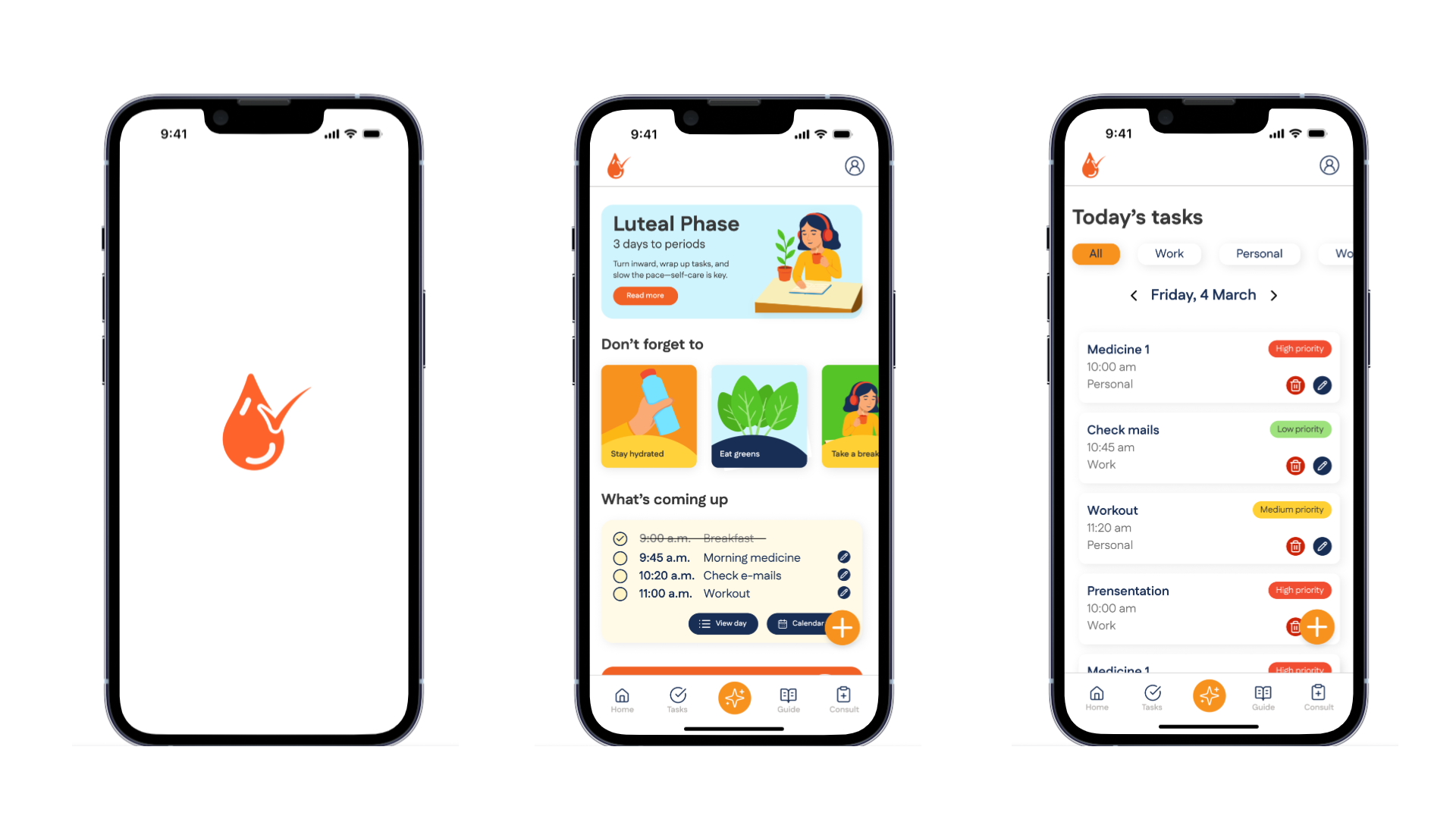
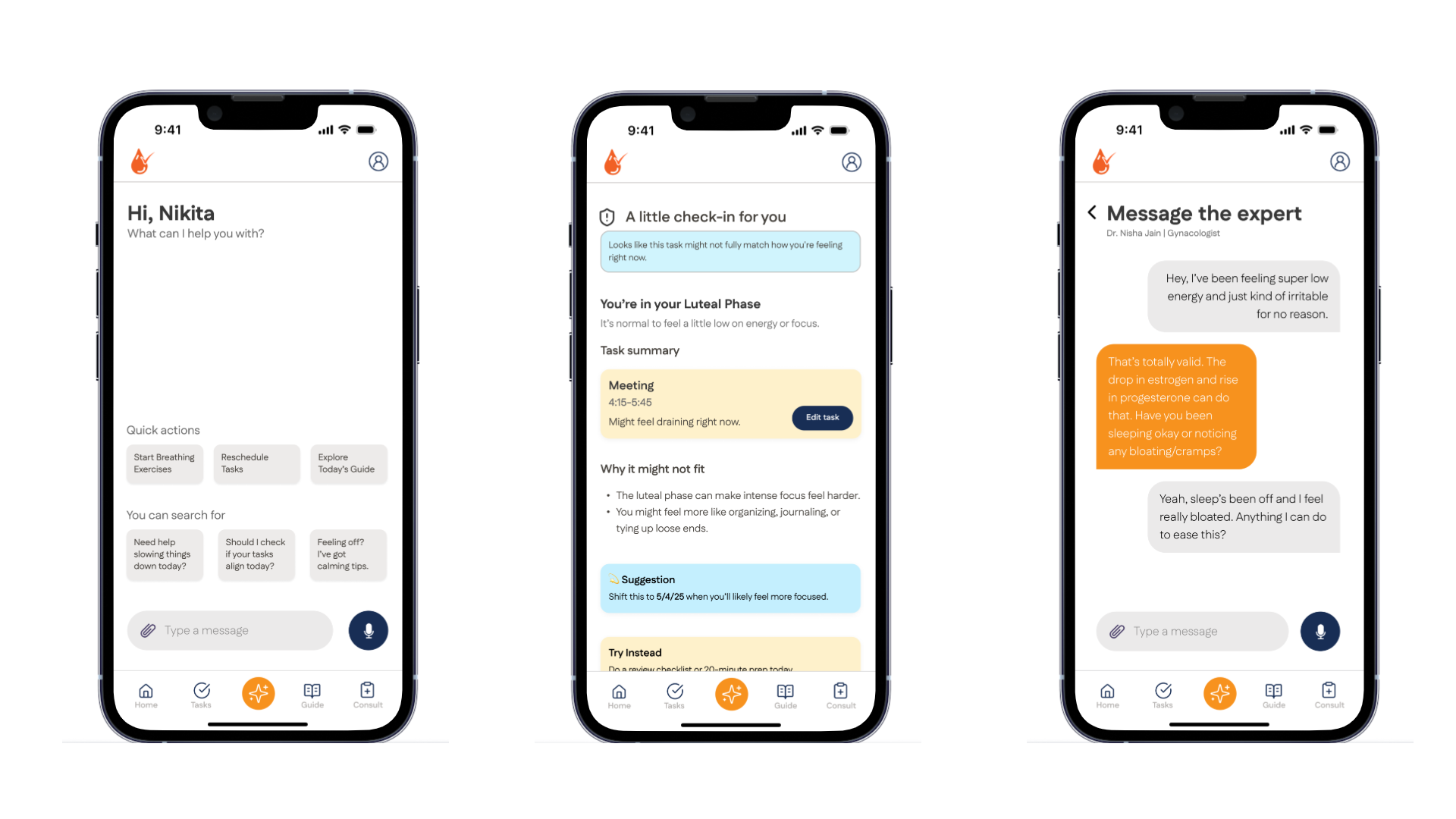
The interface stays warm and low-pressure while still helping users act with more clarity.
Outcome
Experience
Users can quickly understand:
- Where they are in their cycle
- What they might be feeling
- What kind of work fits the day better
Over time, that helps patterns become easier to notice and decisions easier to make.
Expected Impact
- Reduced decision fatigue
- Improved self-awareness
- Better alignment between energy and planning
Product Value
- Moves beyond tracking
- Enables action instead of passive logging
- Introduces a more adaptive view of productivity
Future Direction
- Deeper personalization
- Wearable integrations
- Support for more diverse cycle patterns
- Community-led features
Reflection
This project reframed productivity as something that should adapt to people.
It is not about consistency. It is about alignment.