
iMobile Pay
Redesigning payments for cognitive accessibility
Accessibility is not just about vision or mobility. It is about how clearly a system communicates under stress.
Overview
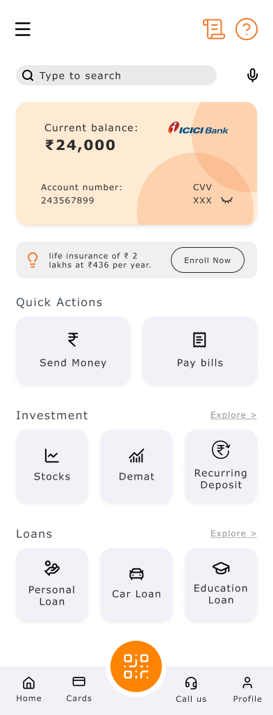
ICICI iMobile Pay serves millions of users with over 400 services. This project redesigns its payment flow for three cognitive profiles: dyslexia, distraction, and anxiety. Targeted interventions that reduce friction without overhauling the system.
Each profile gets its own adapted flow. Same architecture, different communication.
Research
Current Flow
 Click to zoom
Two paths diverge at one decision: existing or new payee? The structure is logical. The problem is how each step communicates.
Screen Flow
 Click to zoom
Information Architecture
 Click to zoom
The redesign stays scoped to "Send money" under Transact. No changes to the broader app.
Pain Points Across the Journey
 Click to zoom
Three worst moments: Confirm (fear of irreversibility), Processing (vague system state), and Success (unclear confirmation).
Frameworks Used
WCAG + POUR. Each screen evaluated against: Can the user perceive it? Operate it? Understand it? A "no" for any profile became an intervention target.
Mismatch Model. Disability is design-induced. The interface creates the mismatch, not the user.
Cognitive Load Theory (Sweller, 1988). Intrinsic load is the task itself. Extraneous load is how info is presented. Every intervention reduces extraneous load.
Flow 1: Dyslexia
What is Dyslexia?
A neurological condition affecting how the brain processes written language. Not about intelligence; it's about decoding. Reading can take up to 3x as long. Users confuse similar letters (b/d, n/u), struggle with dense numbers, and find similar screens indistinguishable.
Pain Points for Dyslexic Users
Meaning Breakdown
Similar terms with different meanings cause misinterpretation. Abstract labels increase cognitive effort.
Number Processing
Digits are hard to scan and compare. Small differences can be misread. 16-digit strings demand serial processing.
Sequence Confusion
Multi-step flows are hard to track. Screens look similar but represent different stages.
Personas
Aarav Sharma | 33 | Working Professional | Delhi
Mild dyslexia, high digital literacy. Skims quickly but pauses at review screens. Sees inconsistencies in labels (Send / Pay / Transfer). Verifies amounts once and proceeds confidently.
Goals
- Complete transactions without errors
- Feel confident before confirming
- Avoid misreading numbers
Frustrations
- Labels that change between screens
- Numbers placed near competing text
- Similar confirmation screens
Journey Map
Aarav stays consistently low (1-3). Mahesh climbs through patience alone. Riya recovers mid-flow but drops at confirmation.
What I Changed
Font and kerning. Increased letter spacing to reduce character confusion (b/d, n/u, m/w). Sans-serif font, larger base size, 1.5 line height. Based on BDA's recommendation of 1.4–1.6 line height.
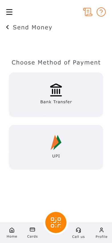
Reduced cognitive load. Fewer options per screen. "How do you want to send?" shows only two large cards (Bank Transfer and UPI) instead of tabs with sub-options. One decision per screen.
Icons bigger, paired with text. Every action has a scaled-up icon alongside its label. Users identify actions visually without relying on reading.
Accessibility toolbar. Header icon opens controls for font size, contrast, and reading mode. Dyslexia severity varies, so Aarav needs different adjustments than Mahesh. WCAG 1.4.4 requires text resizable to 200%.
The Dyslexia Flow
Home
Payment Method
Send Money (NEFT)
Accessibility Toolbar
Add Payee
Send Money (UPI)
Try the Dyslexia Flow
Flow 2: Distraction
Why Do Users Get Distracted?
Distracted users aren't careless. Their environment is noisy. Banking apps are used while commuting, between meetings, and while managing households. The interface needs to survive interruption.
Pain Points for Distracted Users
Working Memory
Forgetting what step they were on. Forgetting what they entered. Forgetting whether money was sent.
Impulse Control
Clicking quickly. Skipping review. Confirming too fast. Realizing mistakes afterward.
Personas
Kunal Singh | 24 | Corporate Executive | Mumbai
Uses app while commuting and between meetings. Phone constantly receives notifications. Switches apps mid-transaction, returns unsure if payment went through. Sometimes re-initiates transfers.
Goals
- Complete transactions quickly
- Avoid repeating actions
- Minimize time spent on banking
Frustrations
- Notifications popping up mid-flow
- Confirmation that looks like review
- App resets after switching away
Journey Map
Kunal and Arjun peak at 5 mid-flow then crash to 2–3. The review and confirmation screens, where context matters most, are where distracted users have the least patience.
What I Changed
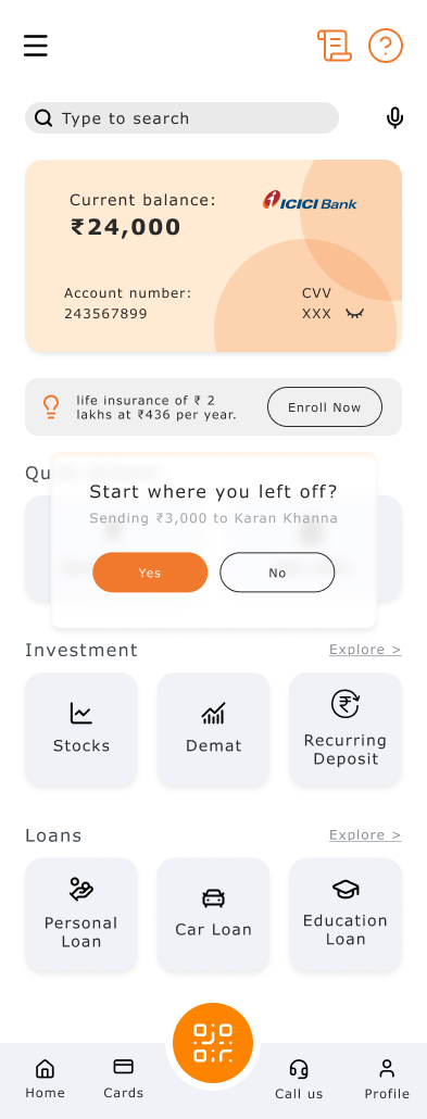
"Start where you left off" dialog. When a user returns after interruption, a prompt shows: "Sending ₹3,000 to Karan Khanna. Yes / No." One tap to resume, one to dismiss. No duplicate payments.
Simplified payment method screen. Two large cards only: Bank Transfer and UPI. A distracted user should make this choice in under 2 seconds.
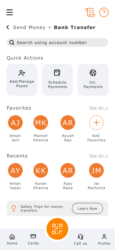
Breadcrumb navigation. "Send Money > Bank Transfer" answers "where am I?" at a glance. Users who lose track of steps get instant wayfinding without re-reading.
The Distraction Flow
Home
Resume Dialog
Payment Method
Send Money (NEFT)
Send Money (UPI)
Scan QR
Try the Distraction Flow
Flow 3: Anxiety
Why Are Users Anxious?
"What if I mess this up?" is louder than "How does this work?" Mistakes mean money loss, wrong recipients, and no easy recovery. Anxious users over-read, hesitate, and double-check, not because they're incapable, but because the system doesn't clearly communicate safety.
Pain Points for Anxious Users
Ambiguous Language
"Confirm payment" does not say what will happen. "Processing..." does not say for how long. "Invalid input" blames the user.
Weak System Feedback
No clear distinction between review and done. Generic status messages. No reassurance that nothing is pending.
Personas
Meera Kapoor | 26 | Junior Accountant | Pune
Handles financial records at work but feels intense pressure during personal banking. Re-reads details multiple times. Avoids large digital transfers unless absolutely necessary. Relief comes from double-checking, not the interface.
Goals
- Feel fully confident before confirming
- Avoid irreversible mistakes
- Ensure every transaction is correct
Frustrations
- Fear of sending to the wrong person
- Relief only from double-checking, not the UI
- Re-reads but still feels uncertain
Journey Map
Meera stays tense throughout. Ravi drops sharply during processing. Sunita crashes when time pressure appears. Peak anxiety: the gap between pressing "confirm" and seeing the outcome.
What I Changed
"No Pending Payments" banner. Green status on home confirms nothing is unresolved. Answers Ravi's "Did it go through?" before he asks. Nielsen's Heuristic #1: visibility of system status. For anxious users, absence of information communicates uncertainty.
Simplified payment method (shared with distraction flow). Two large cards reduce decision anxiety. Sunita doesn't understand NEFT vs UPI. Icon-paired cards make the choice visual, not textual.
QR scan fallback. "Can't pay? Try alternate options" with Pay Mobile and Pay UPI ID. No dead ends. The question format normalizes the situation.
Human-language errors (across all flows). "Invalid input" → "The account number needs 11 digits, you entered 10." WCAG 3.3.1 + 3.3.3, both Level AA. Guides correction without triggering self-blame.
The Anxiety Flow
Home
Payment Method
Send Money (UPI)
Send Money (NEFT)
Add Payee
Scan QR
Try the Anxiety Flow
What Connects the Flows
Some interventions appear in multiple flows. Not because they're generic, but because they solve different problems for different reasons.
Large payment cards
Dyslexia: Reduces reading load
Distraction: Reduces options
Anxiety: Reduces decision anxiety
Structured payee list
Dyslexia: Easier to scan
Distraction: Faster recognition
Anxiety: Less chance of wrong recipient
QR fallback
Dyslexia: —
Distraction: Alternative when stuck
Anxiety: Prevents dead-end panic
Breadcrumbs
Dyslexia: Sequence clarity
Distraction: Re-orientation after switch
Anxiety: Confirms correct path
Iterations
What I tried first. Adding tooltips and helper text everywhere. Dyslexia research says "one idea per sentence." More text made things worse.
Shift 1. From one-size-fits-all to three separate adapted flows.
Shift 2. From fixing screens to fixing moments. The journey maps showed where friction lived.
Shift 3. From system language to human language. "Choose Method of Payment" became "How do you want to send?"
Reflection
This project changed how I think about accessibility. Not a checklist, but a question of how clearly a system communicates when stakes are real and the user is not at their best.
Nine personas across three profiles prevented generic "make it cleaner" work. Each person experiences the same flow differently. Each flow adapts to those differences.
Accessible design is not a separate category. It is just design that takes more people seriously.

