ContentOps
An AI writing tool built around the check, not the draft
Role
Solo Product Designer
Timeline
4 days
Scope
Research, UX, UI, coded prototype
Status
Self-initiated concept
What it is
A workspace for small content teams publishing blogs with AI. One person briefs and edits. Another decides what goes live.
AI tools race to write faster. Writing was never the slow part. Checking was.
The problem
I started where most AI writing tools do: how do we draft faster? Then I watched people use the drafts.
They rewrite
The AI's voice isn't the brand's. Whole paragraphs get redone.
They re-check
Facts, links and keywords, by hand, in a different tool for each.
They re-ask
One weak section means regenerating the whole post and losing the good parts.
Some said they spent longer fixing AI output than they would have spent writing. The problem isn’t speed. It’s trust.
So the product stopped being a generator. It became a pipeline — stages you can see, checks attached to the draft, and two moments where a person has to say yes.
My role
A self-initiated project, done alone in four days. No client and no brief — I set the problem as well as the answer.
What I owned
- Research the problem through conversations and desk research
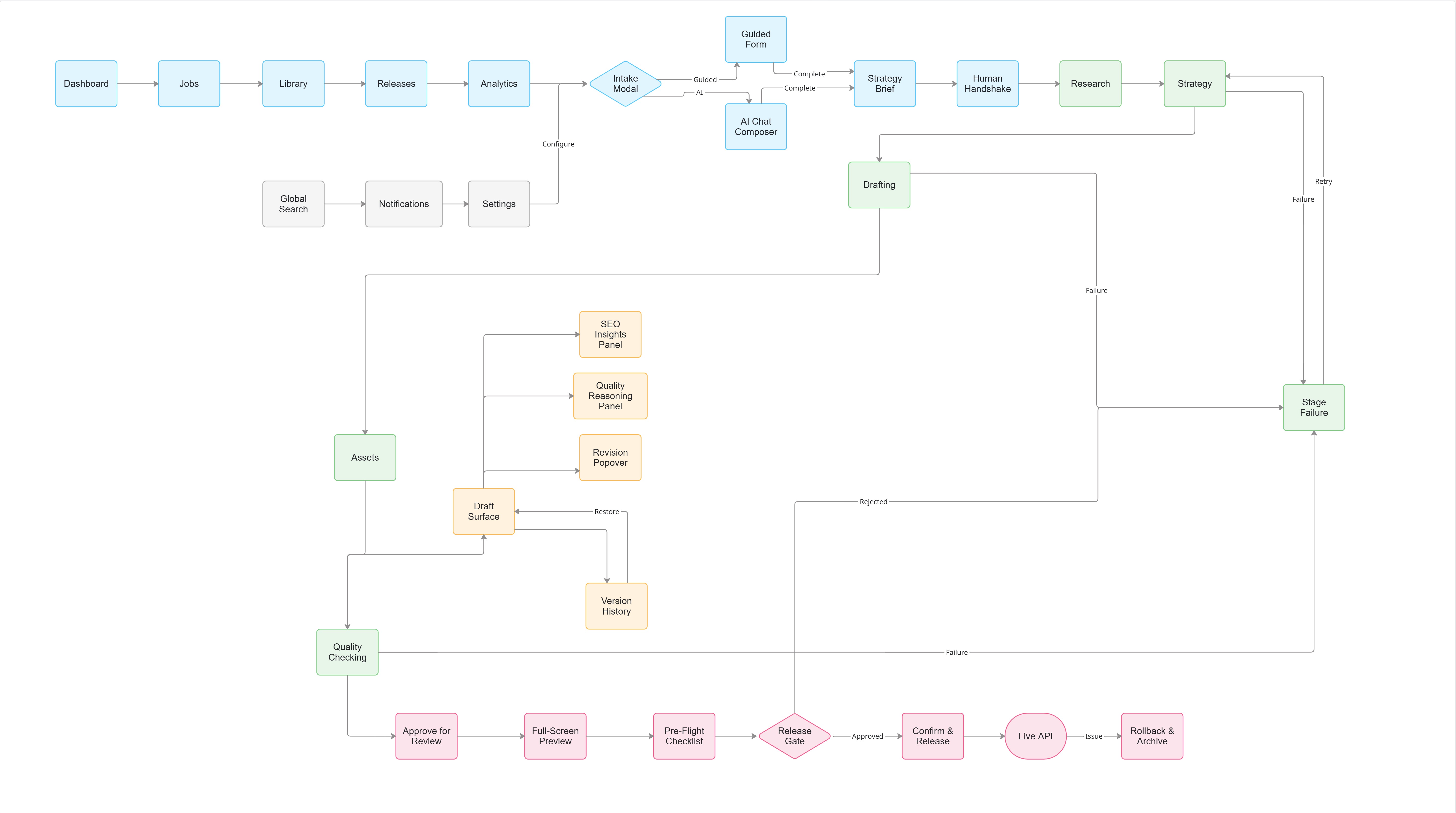
- Map the two-role workflow, information architecture and flows
- Design the interface, from dashboard to release gate
- Build a working prototype with AI-assisted code
Two roles, one handoff
A small team splits the work in two. The design splits the same way.

Priya · Member
Growth & SEO lead
Does — briefs, approves the outline, edits, submits.
Needs — to know if the AI is still working, and to fix one section without starting over.
“I need to go from an idea to a finished preview fast.”

Arjun · Admin
Founder
Does — sets up the workspace, reviews, releases.
Needs — one report that says the post is safe, before it reaches the live site.
“I’m terrified of it posting something robotic or off-brand.”
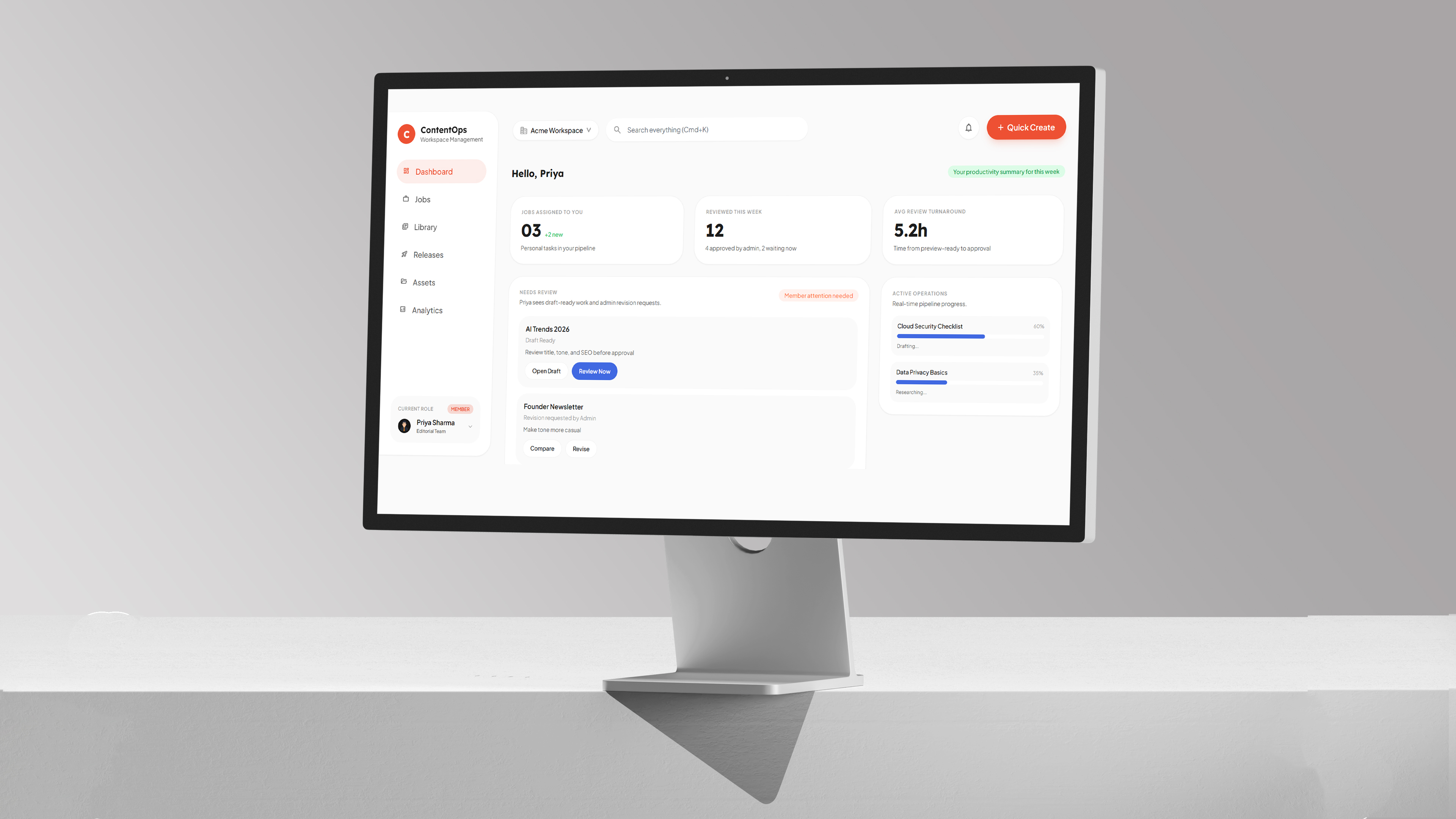
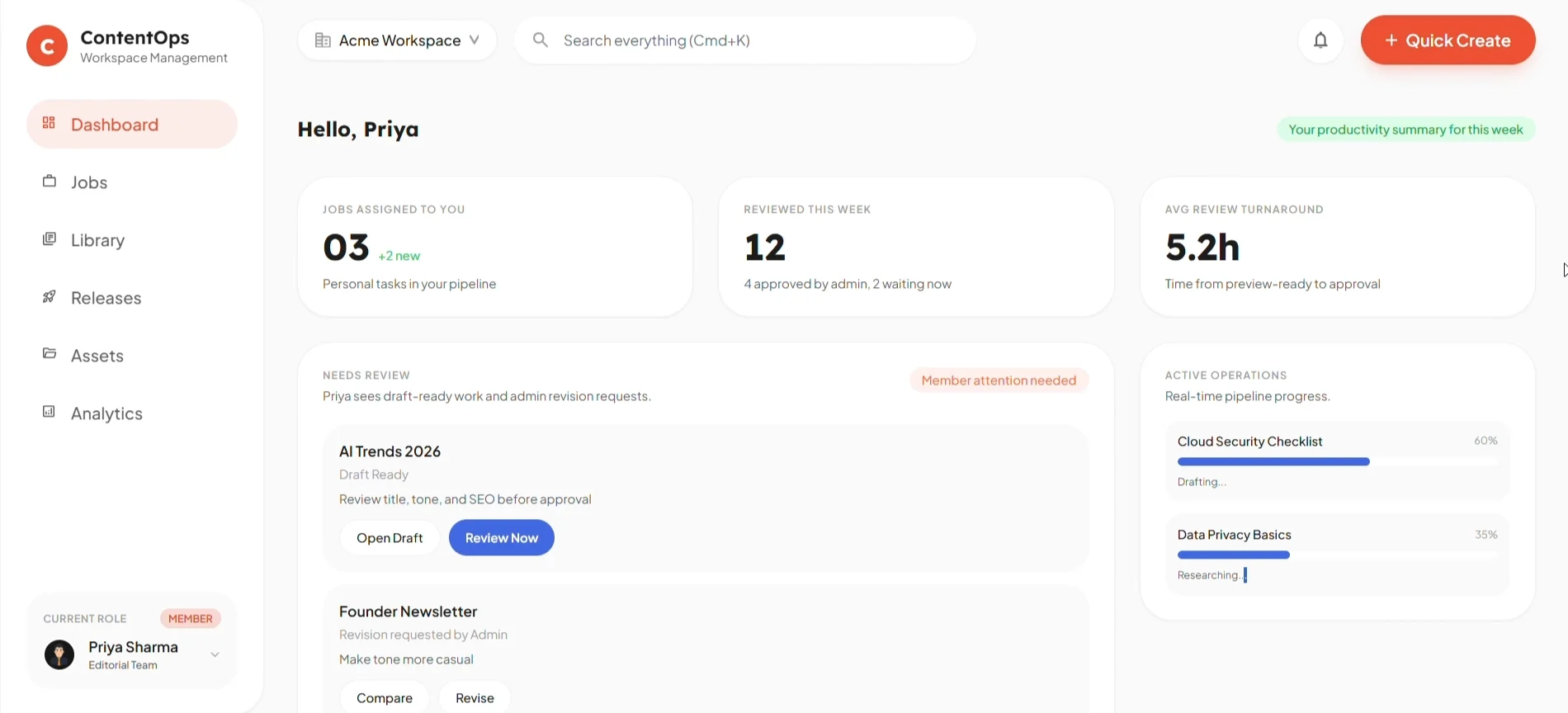
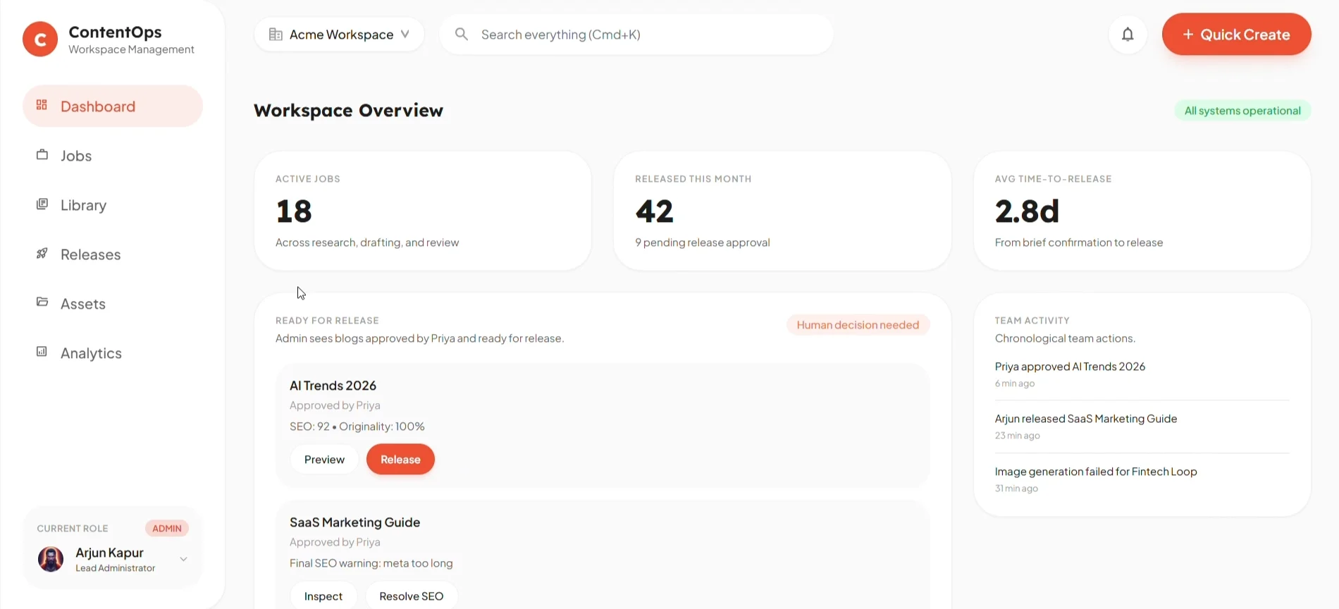
Same app, two front doors. Switch role and the dashboard changes its question — from what should I fix? to what can I release?
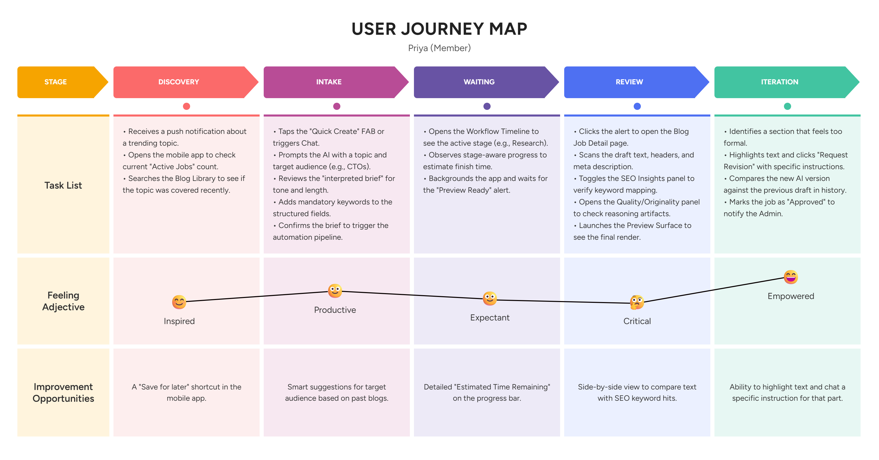
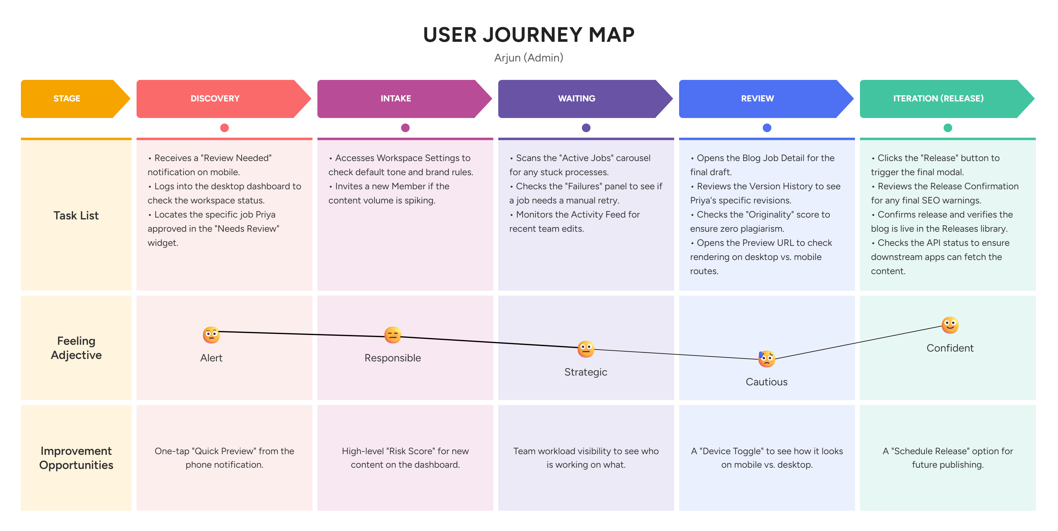
The working filesJourney maps, the full information architecture and the two-role flowShowHide
Priya’s map dips at one stage: review. That’s where she stops trusting the draft — and where most of the product ended up.
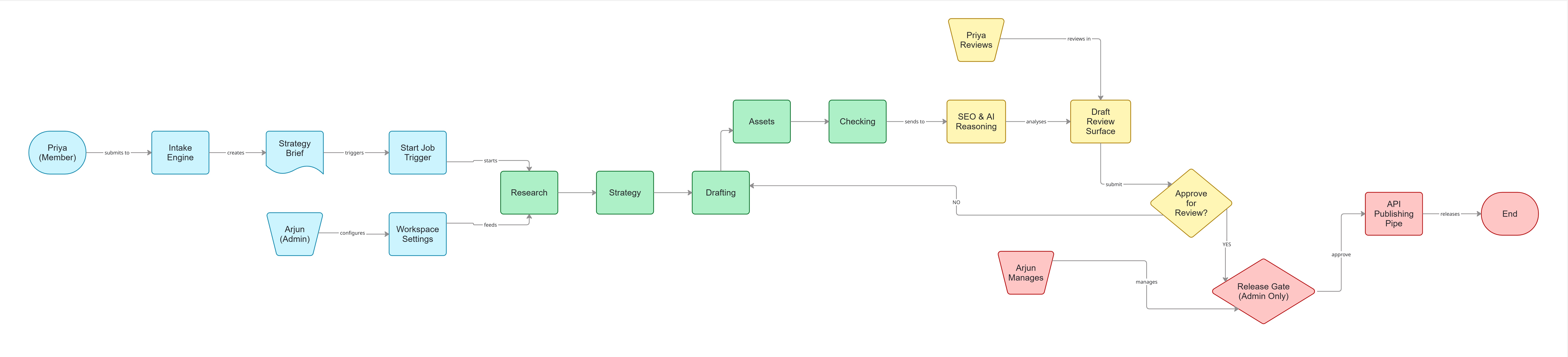
A post, start to finish
Six steps. Two of them are people saying yes.
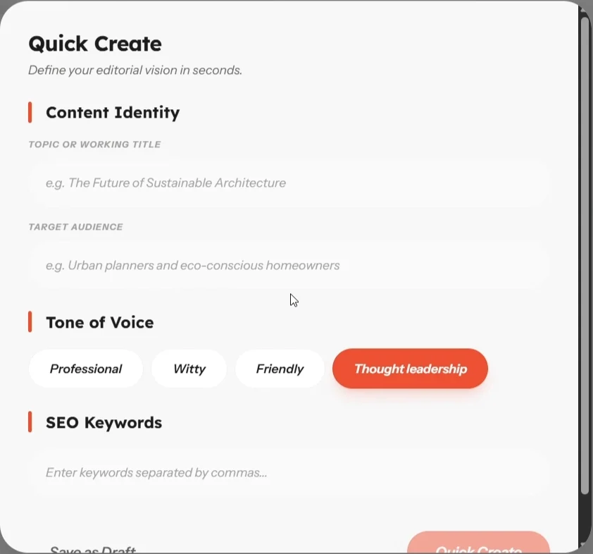
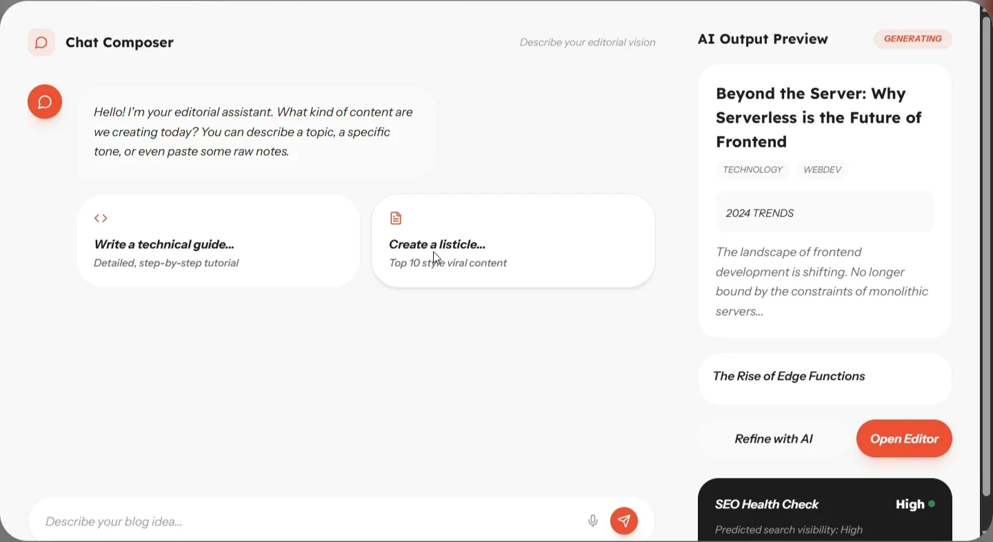
01 · Brief
Fill in a form, or just talk.
Some days you know the keywords. Some days you only have a hunch. Both paths make the same brief.
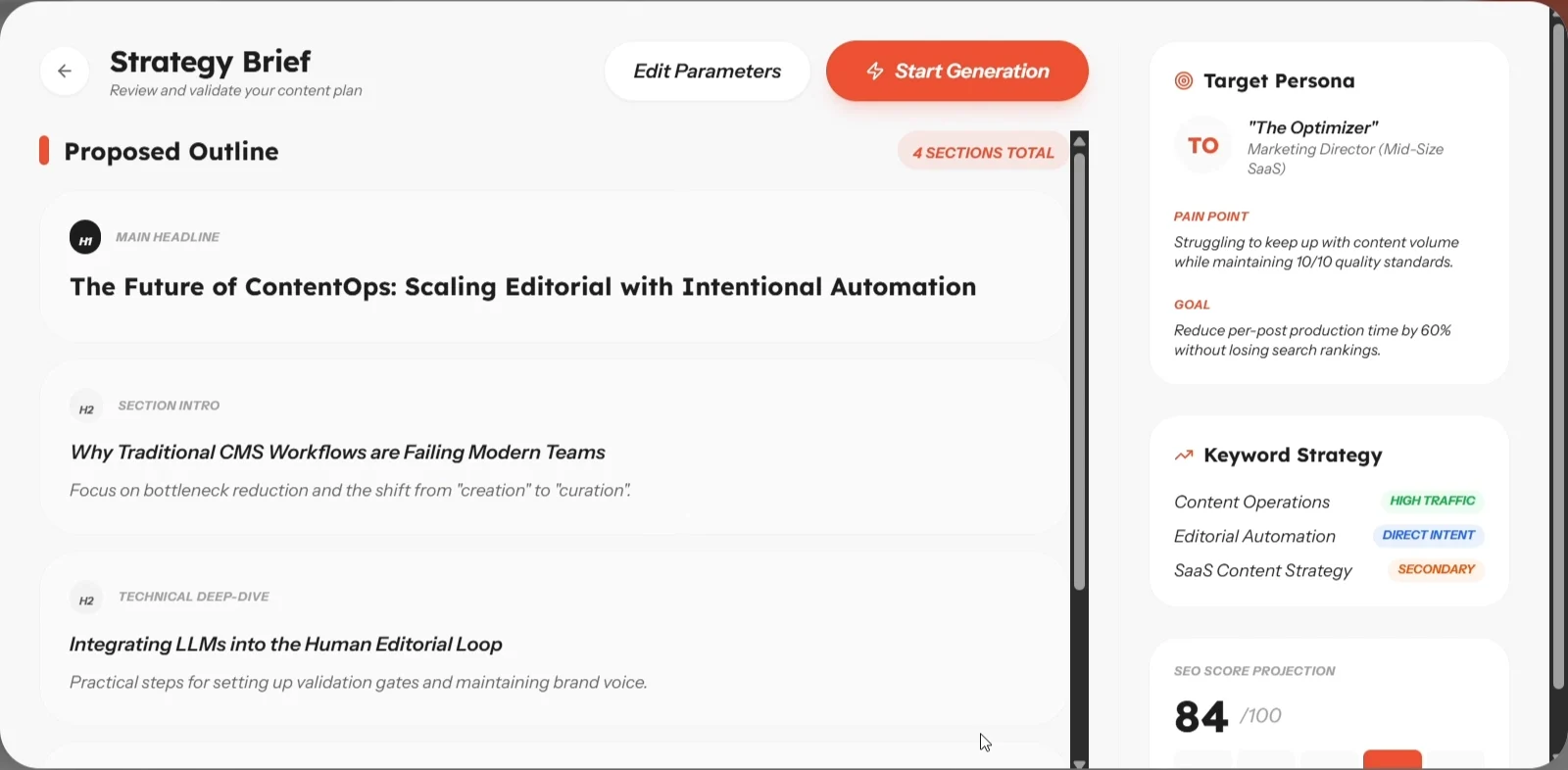
02 · Approve the outline
No drafting until the plan is right.
The AI proposes headings, audience and keywords first. Fixing a heading costs a second. Fixing 1,200 words costs an afternoon.
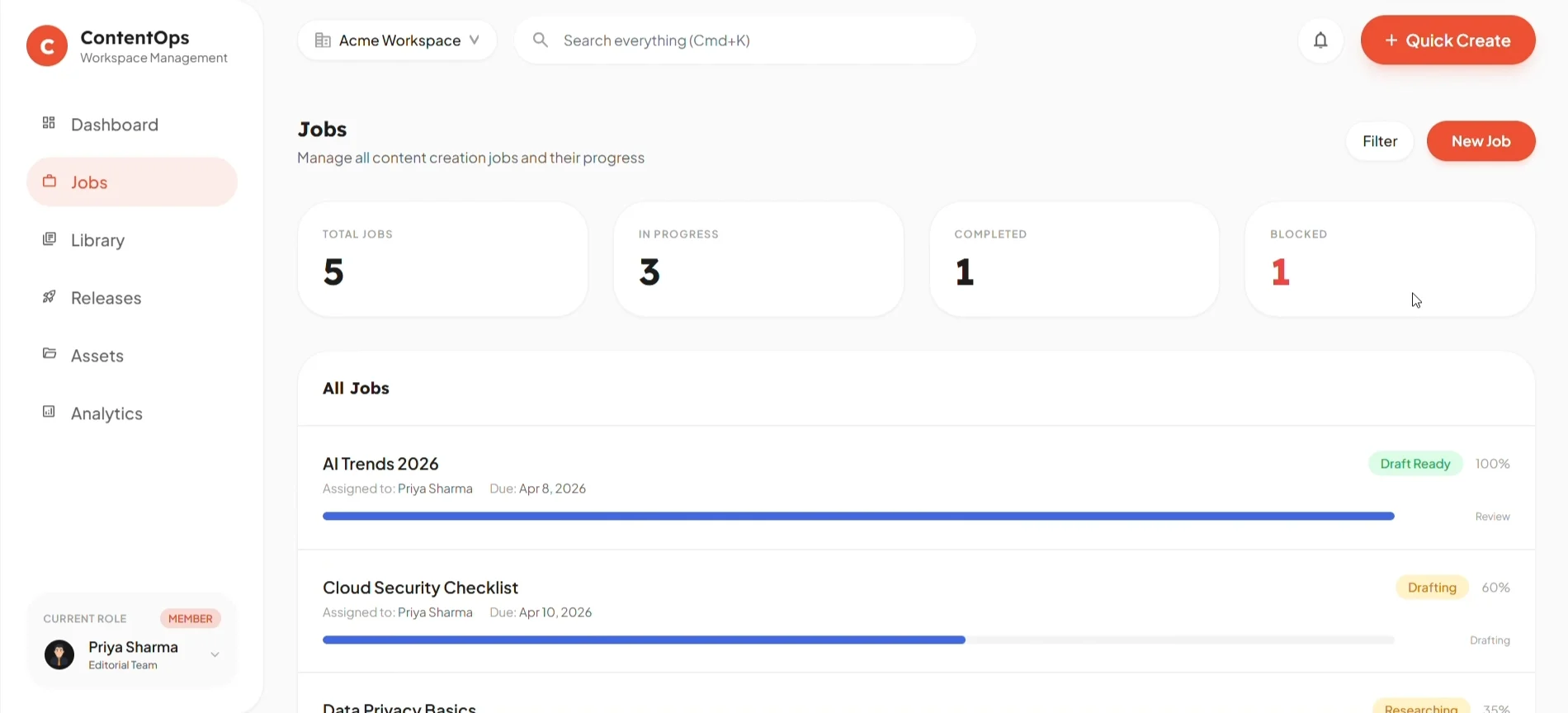
03 · Watch it work
Stages, not a spinner.
Research, strategy, drafting, assets, checking. Priya can leave and still know where her post is.
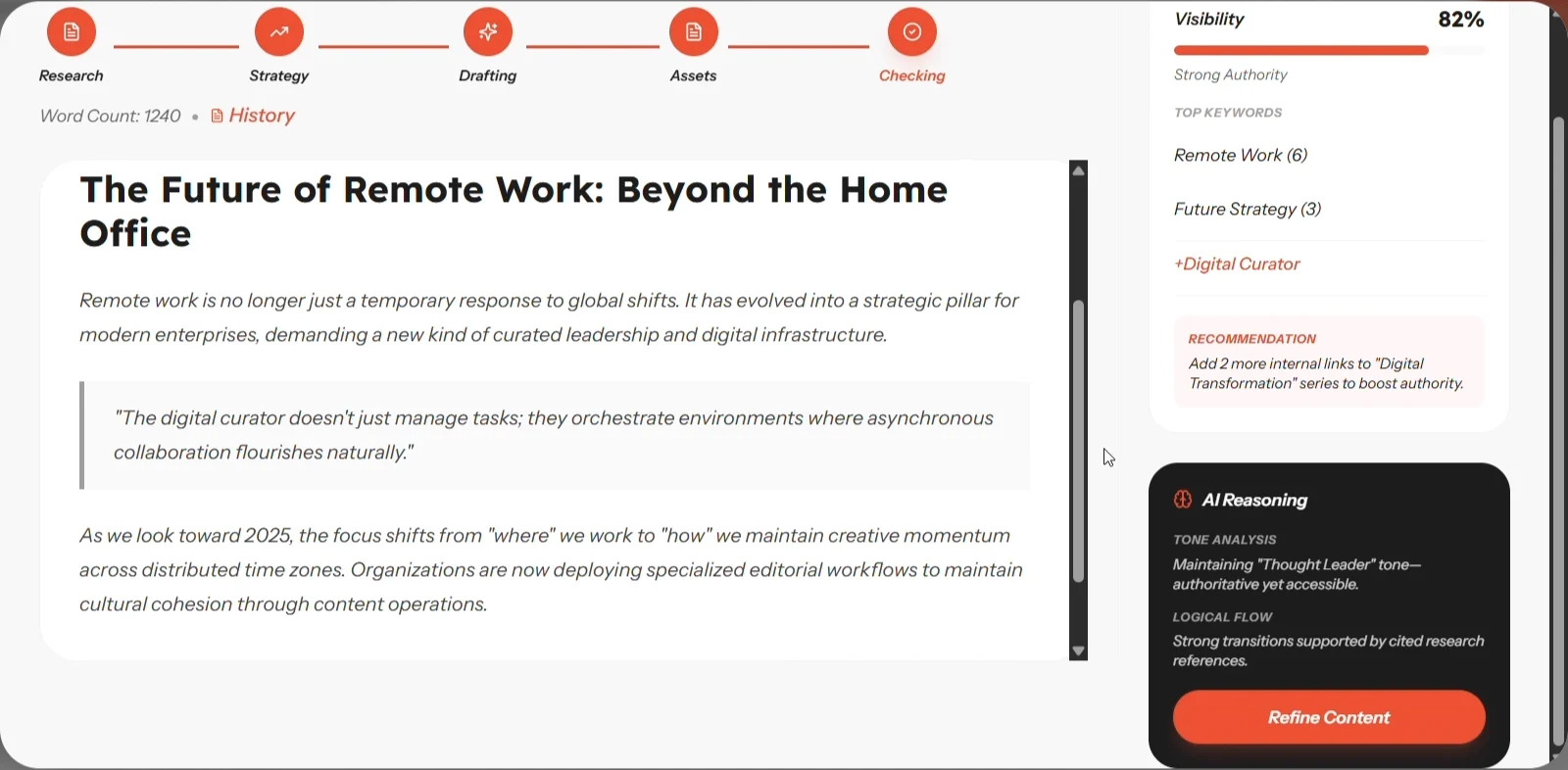
04 · Review with the evidence beside it
The SEO report and the AI’s reasoning sit next to the text.
Keyword counts, a visibility score, and a plain-language note on tone and logic. No other tab.
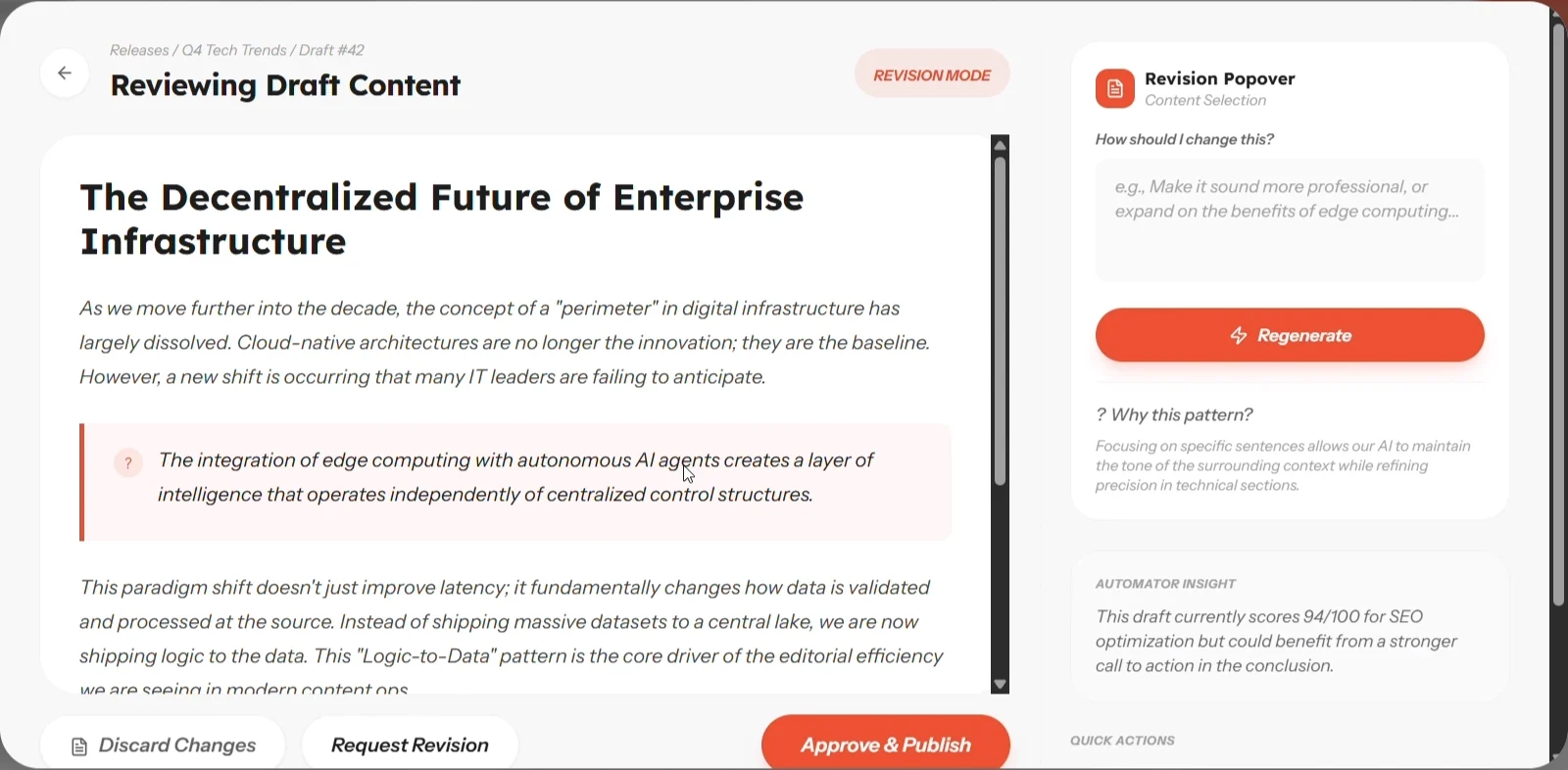
05 · Revise one part
Highlight a sentence. Say what’s wrong. Only that changes.
The rest of the post keeps its edits. Version history is one click away if the new line is worse.
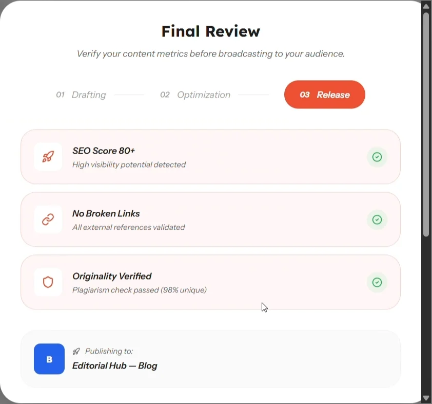
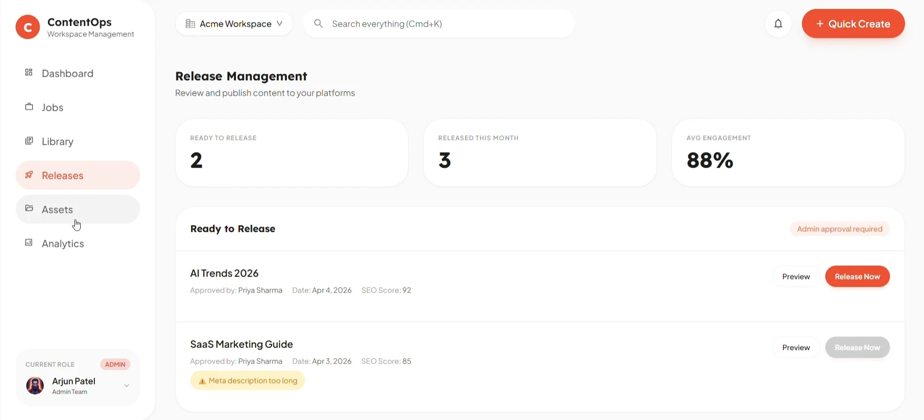
06 · Release
Only the admin can publish, and only when the checks pass.
SEO above 80, no broken links, originality verified. A failed check greys out the button and says why.
The decisions underneath it
Four calls, each one a trade. None of them is free.
01
Approve the plan before a word is written.
Most rework traces back to a wrong angle, not a wrong sentence. The outline is the cheapest place to catch it.
The cost — one extra step before anything appears. The tool feels slower to people who wanted a draft now.
02
The evidence sits beside the draft, not in another tool.
SEO, quality and the AI’s reasoning share the screen with the text they describe. You judge in one place.
The cost — a busier screen. The panels compete with the writing for attention.
03
Revise a part, never regenerate the whole.
Regenerating throws away every edit you liked. Scoped revision keeps them, so fixing one line never breaks three others.
The cost — a rewritten sentence can clash with the paragraph around it. The person has to read for seams.
04
Only one role can publish.
A release gate makes one person accountable for what goes live. That is what lets the founder stop worrying.
The cost — the admin becomes the bottleneck. If Arjun is away, nothing ships.
What changed
The first dashboard showed everything. Charts, counts and activity, all at the same volume. More to look at, nothing that said what to do next.
The shipped one answers two questions. What needs me? What is still running? Everything else moved to its own page.
The system
Warm, restrained, one loud colour. Orange means act — start, release, revise. Everything else stays quiet so the writing stays the focus.
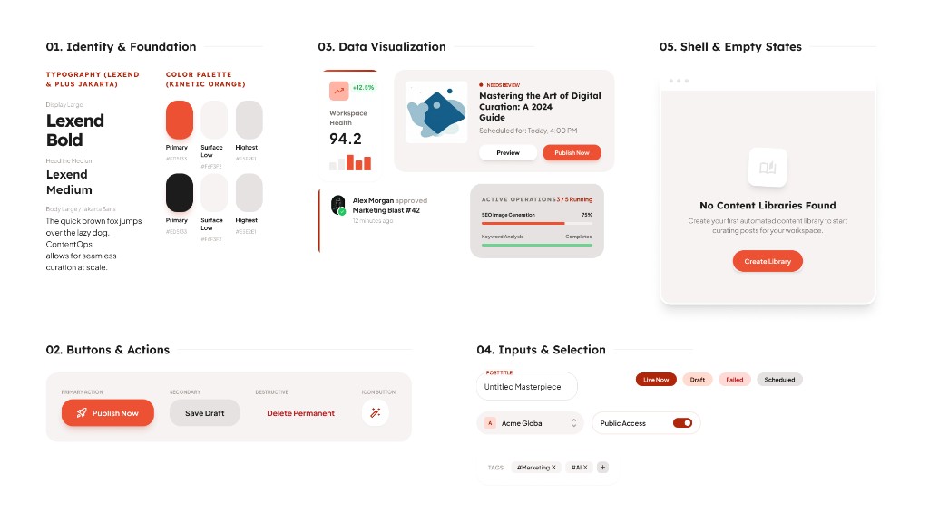
I designed it, then built it as a working prototype with AI-assisted code. A pipeline only makes sense once it moves.
Where it stands
A concept with a clickable build. Not yet tested with a real team.
The first test would time one post, brief to release, against the team’s current tools — and count the tabs. Next on the list: two people editing at once, and a direct push into real CMSs.
What I take from it
AI isn’t the product. The workflow around it is.A model will always be a little wrong. The design job is making that wrongness easy to see, and cheap to fix.